
Creating illustrations for Mervyn Peake’s Gormenghast has been one of the most fulfilling and challenging projects of my artistic career. As I delved into the novel, I found myself captivated by its rich tapestry of characters, the decaying beauty of the castle itself and a city-state fossilised in ritual and mired in the past.
Titus Groan as the 77th Earl and Lord of Gormenghast suggested an ancient lineage going back hundreds perhaps even thousands of years, therefore, illustrating the books as medieval manuscripts felt like the perfect genre to reflect the grandeur of the story. Using traditional methods and materials to bring into being images that could have been created by scribes or artisans in the ancient hallowed halls or scriptoriums of Gormenghast to tell the story of Titus’s adventures.
My journey began with a deep immersion in Peake’s world. The novel’s themes of ritual, identity and the passage of time resonated with me profoundly. I envisioned the illustrations as more than just decorative pieces; they needed to serve as gateways into the story. Each character and setting was steeped in a history that I wanted to honour. I aimed to capture the essence of Gormenghast — its labyrinthine corridors, its eccentric inhabitants, and the palpable sense of decay that lingers throughout but not forgetting the wry humour, cutting wit and absurd mania.
In addition to the books, I delved into the life of the author which gave inspiration to many of the pieces of art — ‘The factoy’ is a blatant nod towards Peake’s time as a war artist at Bergen-Belsen concentration camp. Whilst, ‘The Tower of Flints’ and ‘Illusion’ are reflective of his state of mind. “ The Golden Hall’ illustration presents the characters as a cast from a play, a nod to Peake’s playwriting talent.
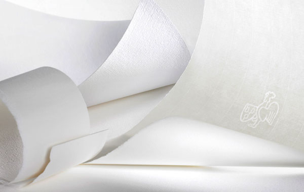
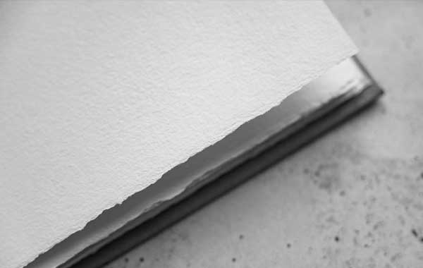
To create authentic illustrations, I turned to the techniques used by medieval artisans. I sourced handmade Vellum made by William Cowley Parchment Makers, reminiscent of the parchment used centuries ago. Working with natural pigments—Egg tempera, Calligraphy gouache and ancient recipe inks that produced colours both vibrant and earthy. This process was labour intensive, requiring careful preparation, but it felt essential to the authenticity I sought.
Metal leaf being my favourite material to work with. I loved the way it captured light and brought a luminous quality to a very dark and dower citadel. Each application of gold was intentional, highlighting borders and key elements of the narrative and emphasizing moments of beauty amid the decay. This choice mirrored the way medieval artists would elevate significant figures or motifs in their work, adding an ethereal quality that drew the viewer’s eye. The metal leaf evolves from Gold for the first book, Bronze leaf for the second and finally Pewter for the third.
As I worked on each illustration, I kept returning to the themes of Peake’s writing. The contrast between vibrancy and decay seemed to echo throughout Gormenghast. I often portrayed characters in moments of stillness or contemplation, surrounded by the castle’s haunting architecture within each illustration a sense of being watched. There was something poignant about capturing the essence of a character’s struggle against the backdrop of such an imposing, crumbling structure. It felt like a visual representation of the novel’s exploration of tradition and change.
Throughout the process, I often found myself reflecting on the nature of storytelling itself. Each illustration became a narrative moment, inviting viewers to step into the world of Gormenghast and explore its layers. I wanted my work to resonate emotionally, evoking a sense of wonder and introspection. Peake’s characters are complex, and I aimed to capture their multifaceted lives through my art. The act of illustrating felt like an exploration, not just of the story but of the very nature of creativity and expression.
As I completed the illustrations, I was struck by how this project bridged the gap between the past and the present. Using traditional techniques allowed me to create a dialogue with history, while still making the work relevant to contemporary audiences. Each piece became a celebration of both Peake’s literary genius and the rich heritage of illuminated manuscripts.
In the end, my hope is that these illustrations breathe new life into Gormenghast, inviting readers to immerse themselves fully in its enchanting world. I wanted to create a space where art and literature intertwine, a place where the beauty of the past informs our understanding of the present. As I look at my completed work, I feel a sense of gratitude toward Suntup Editions for the faith they showed as well as the journey, both artistic and emotional, that allowed me to explore the world of Gormenghast.
Jay Johnstone
October, 2024





Tracey Tell
Jay Johnstone has created some lovely illustrations for this edition. They are spot-on in eliciting the ancient feel of the story. I’m really enjoying the behind-the-scenes look into these talented artists that Suntup has been providing.
Sam S
I love the fusion of Byzantine and Renascence in this style… it’s also very fitting for a book that has a sort of late mid-evil early Renascence feeling.. Excited for winter 2025 to come so I can get my copy.