
At Suntup Editions, we are always exploring ways to enhance the beauty and craftsmanship of our books. You may have noticed that some recently announced titles include illustrations printed using the giclée process. This decision reflects our ongoing effort to deliver the highest quality possible to our customers.
What is Giclée Printing?
Giclée printing, pronounced “zhee-clay,” is a method that combines the precision of high-resolution digital printing with the richness and depth of traditional fine art reproduction. Unlike the more widely used process of offset printing for color illustrations which uses a limited number of ink colors and often relies on screens or dot patterns, giclée printing employs a broader spectrum of archival-quality inks sprayed onto fine art paper. This process results in a print that closely mirrors the original artwork, capturing every nuance of color and detail with unparalleled accuracy.
The term “giclée” itself is derived from the French word gicler meaning “to spray,” which refers to how the ink is applied to the paper. The technique allows for a more continuous tone in the image, eliminating the dot patterns visible in offset printing, and providing a smoother transition between colors. The outcome is an image of such vibrancy and fidelity that it can be difficult to distinguish from the original painting or drawing. This printing technique represents a substantial upgrade in the quality and presentation of our illustrations.
High Quality Fine Art Papers
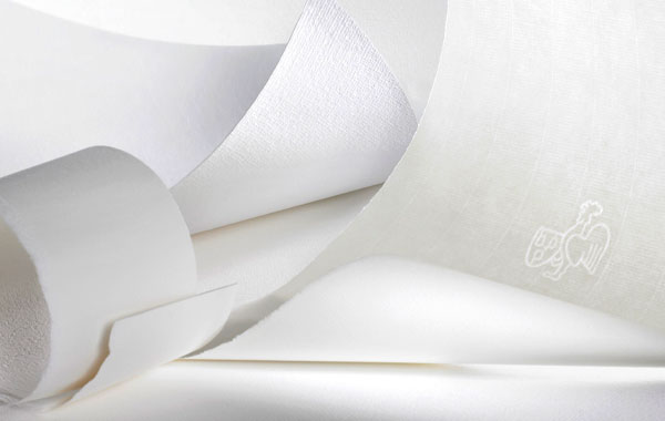
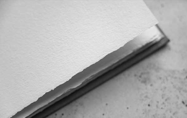
In addition to the giclée printing process, we carefully select the finest papers to complement the quality of the illustrations. For these editions we currently print on Hahnemühle Bugra, a premium mouldmade paper renowned for its durability and texture. This paper is 100% alpha cellulose and acid-free, ensuring the longevity of the prints, and its subtle texture adds a tactile dimension that enhances the depth and richness of the artwork. The combination of giclée printing and fine art paper results in illustrations that not only look stunning but also stand the test of time.
Commitment to Quality
The introduction of giclée-printed illustrations in some of our books is not just a technical upgrade; it reflects our ongoing commitment to quality. We believe that our discerning customers, who value the artistry and craftsmanship of our limited editions, will appreciate the elevated experience when viewing these illustrations.
Giclée printing ensures that the illustrations in our books are true representations of the original artwork. The depth of color, the sharpness of detail, and the overall aesthetic quality of these prints elevate the entire reading experience.
Printed In-House
To ensure the highest level of quality and consistency, we print our giclée illustrations in-house. In fact, Paul Suntup is the person who prints all giclée art for the editions which feature them. We use a high-end fine art printer specifically designed for this purpose, allowing us to closely monitor every detail of the printing process.
Looking Ahead: More Giclée-Printed Editions to Come
Although we cannot include giclée printed illustrations in every title we release, or in every state of every title, we do have more editions in the pipeline with illustrations printed by this upgraded printing process. Offset printed illustrations have served us and our customers well, and they will continue to do so, but where feasible we will be including giclée prints in more editions.
In a world where mass production often overshadows craftsmanship, we are proud to stand out as one of the few publishers in our field who is publishing our books with this elevated level of illustration printing.
Thank you for being a part of our journey as we continue to innovate and elevate the art of bookmaking. We look forward to sharing more of these editions with you in the near future, and we hope that each one will become a testament to the enduring beauty of both the printed word and the visual arts.
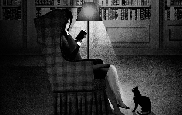
Illustration © 2023 by Mario Robinson from To Kill a Mockingbird.

Tracey Tell
This is great news! I can’t wait to see some examples first-hand. I don’t know if the process of the actual printing looks any different, but if it does, I’d love to see one of those BTS videos! Thanks for elevating the editions.