
From Reader to Illustrator
American Gods made a lasting impression on me from the moment I first read it. This road trip across the United States, from state to state, from car to car, from character to character, had charmed me with the freshness of the adventure it offered. I remember feeling like I was quietly accompanying Shadow on long imaginary roads tinged with memories of Jarmusch or Lynch films—a striking contrast for someone from an old European forest, deep in the heart of the Breton countryside—yet the themes the work addressed paradoxically felt very familiar to me. As I finished reading, I was captivated, carried away by a fresh and modern imagination, contrasting with that of other works I was reading at the time. When I closed the book for the first time, it was only to reopen it years later at Paul Suntup’s invitation.
In January 2021, I was deeply immersed in the conception of my artbook Forgotten Gods, in an extremely dense working phase, when I received a message from Jason Sechrest: “We are currently publishing a signed limited edition of American Gods by Neil Gaiman. We would be delighted to commission you for this project, bringing you aboard as the illustrator for this edition.” The proposition came from an American publishing house whose name I already knew well, as they collaborated with colleagues I esteemed. I had seen countless times on my social networks the meticulous work of Suntup Editions, with their impeccably presented publications, the result of the meticulous work of a team I would later come to know. After they agreed to extend the deadline so I could finish my book, I finally realized: I was going to illustrate American Gods! A dream come true!
I gave myself some time before actually starting the creation of the illustrations, and ideas were already swirling in my mind. The initial commission mentioned six interior illustrations, but I had a thousand ideas in my head. It was crucial that my selection be refined; I needed to capture the essence of the work in a concentrated set of images. Several months were dedicated to rereading the book, researching sources, annotating car models, and tracking Wednesday’s costume changes. The lengthy process plays a very important role in my approach to creation, especially during the exploration and research phase. It’s the time needed to connect my ideas, for inspiration to travel, and for the luxury of wandering.
I tracked Lakeside, read memoirs, and enjoyed the speculations of readers. I noted every piece of music mentioned in the book and made a playlist that played during my quest. I added the pieces of music that Neil Gaiman mentioned as part of the book’s conception. I bought maps of the United States on eBay, dated from 1998 to 2001, to see the roads the author might have been aware of when writing the book. I noted the routes, the roads taken, the states crossed, the landscapes glimpsed, the cities traversed. I studied the symbols, the goddesses and gods, the creatures and men that filled the pages. Finally, I studied the plot, the passages between the world and the otherworld, the highlights, what the story revealed. In the end, I turned them into small images that I lined up on pages and pages. I began to extract motifs from the work, represented by simple symbols, until I obtained a visual chronology of the book page by page. It was necessary to gather thousands of visual, musical, and literary references – a blend of pop culture, history, mythology, and folklore – into a coherent set of illustrations, while still capturing the richness of the book in six illustrations. An impossible challenge.
At this stage, it was necessary to synthesize this long archival work to enter into an artist’s approach, to define axes and sacrifice ideas. And to determine them, since I was the illustrator, I had to rely on my own journey and perceptions. I had to follow Shadow, let myself be fooled by Wednesday, and walk the line between the world and the backstage of the world. If American Gods was so dear to my heart, it was because the life I had led was a fairly similar journey. I had left the city, experienced wandering, encountered formidable losers, celestial tramps, and even visited Lakeside. Unlike Shadow, I had ended up settling there, and the gods had eventually left me alone. I still regularly ate at Mabel’s and continued to encounter Wednesday, a little more fragile and depressed. I had some cards up my sleeve to accompany the narrative with my brush.
Lakeside: A Melting Pot of Myth and Reality
Lakeside, the place I call home, which was on the fringe of the world when I settled there, has the characteristic of cohabiting myth and grand history, imaginary space and real space, artistic flight and rural common sense, nature and industry, the aristocrat and the punk, the worshipper of the great goddess and the humanist atheist. It’s a place I truly chose for its diversity of viewpoints and the freedom it offered me. An environment that pushed me to study the mechanics of storytelling, myth, and to love the stories passed down from human to human. Finally, on a deeper, more intimate level, it’s an environment that invited me to take an interest in politics, philosophy, and the social sciences. This deeply shaped me, permeating each of my actions, and led me to explore the themes of the margin, passage, and border in my work. Themes omnipresent in Neil Gaiman’s work.
Simultaneously, as an artist deeply interested in symbolism and dark romanticism, I’ve always been keen to bring together art and craftsmanship, even before falling in love with the works of William Morris. A true passion that naturally connected me to the Arts & Crafts, Art Nouveau movements, and other forms of total art combining reflection on art and a love of the craft. These artistic movements allow me to explore various mediums with great curiosity and a certain playful pleasure while infusing my approach with a political artistic philosophy.
This is the story that binds me to American Gods, and thus, in my opinion, the best axes I could develop as an artist. It’s not for me to say if I was a good choice for American Gods, but American Gods was a good choice for me.
Navigating Themes and Imagery: Crafting Visual Narratives
Naturally, certain passages stood out: those that seemed essential to me, the pillars of the narrative that defined the very essence of the novel. And those for which I had affection, with which I shared a common history, which emphasized the hazy border between the world of men and the world of myths. I chose to select themes that brought the two together while taking care to spread the illustrations throughout the book. I needed passages with strong symbolism, margins filled with art, whimsical myth, raw reality, and diversity to represent the full extent of the book. Drawing on my chronology of symbols, I selected several key moments, about ten points of intersection between the novel and me. This phase of dialogue with the work gave a colour to my work, even before starting.
Then a somewhat wild idea crossed my mind.
In January 2022, I was still enchanted by a work that I had finally seen with my own eyes at the Brussels Museum of Fine Arts, during an artistic journey with my artist partner, Psyche: The Fall of the Rebel Angels. I had gazed at it for a long time, already with American Gods in mind. It’s a fantastic, wild, rich, and timeless work, much like what I wished for the book. But above all, mesmerized as I was, instead of Bruegel’s angels, I saw Wednesday, Shadow, Czernobog, and Anansi in the wild race of the carousel, surrounded by their multiple strange avatars. A delirious waltz entirely in line with the author’s description. I already had the idea to parody Hopper, as an evidence, by seating Shadow and Wednesday in his famous diner while giving it all the strangeness of a place set in the backstage of the world, but this approach to anchoring American Gods in a classical work then concerned only the Frontispiece. In a spark, it became possible for me to weave broader links with Fantastic art.
American Gods is as much a journey through contemporary America as it is a journey through the stories of all the nations that compose it. It’s a journey through the history of Fantasy and Fantastic art. Fantasy and Fantastic art bring together folklore, myth, tale, and all the stories, big and small. Why not make this contemporary mythological tale a visual journey through the history of Fantastic art to the works that have marked American culture more recently? This allowed me to borrow different styles, evoke different feelings, with different techniques and to achieve a great diversity of representations in a small number of images. That’s how my visual guiding thread was born.
The connections with other works happened very spontaneously and coherently. I have a good artistic culture, I spend a lot of my time visiting museums and exhibitions, and I have a solid base in the history of Fantastic art. Some additional research on works specifically associated with American culture only confirmed my choices.
When I sent my first sketches, there were seven, the result of a drastic selection—I had notably sacrificed two very inspiring images that I had in mind—so that Rebecca Dornsife, the art director, and Paul Suntup, the editor, could make the selection of six images. Among them, a tribute or a nod to Pieter Brueghel the Elder, Arnold Böcklin, Edward Robert Hughes, Gustave Doré, Grant Wood, Edward Hopper, and Zdzisław Beksiński. It seems that they liked the seven concepts because the order went up to ten interior illustrations, an opportunity for me to reintegrate all the images I had in mind and to add Alfons Mucha, Vincent Van Gogh, and Ferdinand Keller to the pantheon of American Gods.
There was something exhilarating about trying to match the book’s identity while praying to my own gods. However, I couldn’t help but apologize to Albert Bierstadt, Georgia O’Keeffe, Maxfield Parrish, and Norman Rockwell for abandoning them along the way. It wasn’t enough to be part of history; I had to establish a natural correspondence while adding an additional dimension to the corpus of works. American Gods had to be a multifaceted gem; redundancy would have impoverished its singular character.
This was followed by a frenetic phase of creation. A mix of research and painting, tracking the look of a police car in South Dakota, sewing a dress, shooting photos under the full moon, sculpting, the smell of oil paint, sharpening pencils, drying boards, audiobooks, gold leaf gilding, inking, watercolouring, the look of the 90s, tiny golden windows in huge buildings, more research, and more painting. I embraced different techniques, explored aesthetics that were less familiar to me, and studied American culture in concert. I established a connection between Lakeside and Isle of the Dead with a certain mischief. I enjoyed propelling The Valkyrie’s Vigil to Chicago. I loved the idea of orientalising Böcklin’s Tomb and especially associating it with eroticism. Eros amidst Thanatos. Mucha’s Le Pater became an opportunity to contemplate pagan gods, while the inhabitants of American Gothic abandoned their farm for a hanged man. Starry Night offered a journey through America, painted on a road map, and I filled The Slav Epic with cars to make it a gateway to the otherworld. Finally, Beksiński’s Tombs became the stage for the confrontation of the gods. A slightly crazy journey, like the book.
Collaboration in Artistic Research and Print Management
In conjunction with this artistic research and very early in the creation process, Paul Suntup entrusted me with the selection of the printer and the management of the prints for the illustrations. I have some experience in the printing field, and I have been producing my own art prints for years, with all the knowledge that the graphic chain implies. This allowed me to organize my entire creative process, and in particular, to anticipate a subtlety: the initial order was for six illustrations, eventually increased to ten, incorporating work with reproducible gold foil printing. This is the hallmark of my work and part of my specificity. Alan Lee, the extraordinary English artist, beautifully wrote in the preface of my book: “Adding decorative detail to the pages can simply provide a beautiful setting or framing, to these vivid images, but it can do much more; adding cultural context, extra layers of storytelling and act as an intensifier. Yoann uses his sinuous and coiled linework to feed energy back into his densely shadowed and mysterious paintings.”
Each image had to be conceived in a way that added this layer of symbolism, this divine dimension evoked by illumination, which lends itself so well to a work about gods. An additional difficulty, but also an additional dimension. These gildings allowed me to play with composition, highlight a detail, halo a god, immerse teenagers in the delicate curves of Art Nouveau seaweed, conjure lightning, invoke stars, iconise a 1969 Chevy Nova, or suggest an embrace of Celtic interlacing and Egyptian lotuses. Gold enriches the image and tells its story as in a monk scribe’s manuscript. This allowed me to tell many things in very few images.
The frontispiece is a particularly telling witness of this work. The entire golden frame surrounding this nod to Hopper is a narrative representation of the book. Do not look at it in detail if you have never read American Gods. There are three different gold leaf colours that compose it: one thread for Shadow’s fate, one for the old gods, one for the new gods. I concealed all the important scenes and interactions in chronological order. It starts in the top left and reads counterclockwise until the end of the book. Feel free to wander through it if you wish. In the centre, by invoking Nighthawks, I was already conjuring an imaginary. By treating it in the manner of an ancient engraving, nourished by Gustave Doré’s work, I gave it a timeless dimension. All that remained was to hide a Chevrolet with its headlights on, its windshield reflecting the Moon, to evoke the setting of the final showdown in the background, to hide posters of 69 Love Songs and Twin Peaks, to reserve a parking space for the Buffalo and a second for Odin, to conceal a mysterious man in the shadows, and to wear it all down a bit. I just had to sprinkle a few bones and scattered rubbish and then install two neon signs that let you know where you are and who’s who. I approached all the illustrations with this approach, this hard work, and this mischievous pleasure.
The cover is the last illustration I produced, it was the result of several back and forths. It took me several months before I visualised it and it appeared to me as obvious. Several first versions showed a car suspended above a city, navigating through dozens of iconic monuments of American culture towards Yggdrasil, all bathed in the colours of the American flag. A very evocative landscape but one that did not have the required impact for a cover. This mental image couldn’t leave me.
It was when imagining Wednesday in his modern chariot that everything lit up. I loved the idea of this Baron Munchausen, who instead of being clung to his cannonball, rode a Chevy Nova—I fell in love with a 1:18 scale model of the vehicle, which would accompany me later in my realisation—escorted by two white ravens (personal liberty to invest them with a psychopomp character, while maintaining my colour charter). I had already set up the rest of the scenery: the car suspended, the iconic monuments, and Yggdrasil. It was only a matter of style. And what style could be more evocative than this Art Nouveau structured on the border of Art Deco that can be found in Klimt, the last master of American Gods’ pantheon, to symbolise the American Golden Age? The structured Art Deco of civilization associated with the Art Nouveau curves of Yggdrasil’s branches. The colours were obvious, I had already found them: a balance of red, blue, and white. Gold, on the other hand, scattered Golden Gate Bridges, Empire State Buildings, Brooklyn Bridges, the White House, and other Washington Monuments.
Beginning and End of an Artistic Journey
Here begins American Gods, the first image you’ll see in the book once in hand, and the end of my graphic adventure. Or almost. An exciting journey, in the company of a fabulous team, in the service of a book that promises to be exceptional. As a final touch, and to harmonise the overall aesthetic, I designed the Yggdrasil interlace that was to adorn the cover of the Numbered edition, as well as the design of the two coins – the sun and the moon – which were to nestle among the roots of the world tree.
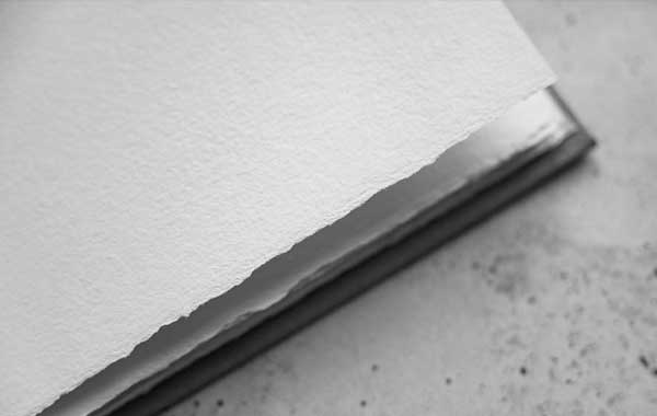
All that was left was to coordinate the printing of the illustrations with the printer of my previous book: Escourbiac. This work was carried out with the great precision for which this printing house in the south of France is capable, faithfully reproducing my artistic work. We selected a paper from a high-quality Italian paper manufacturer, with ideal characteristics for reproducing this work: a lightweight paper with a certain stiffness, pleasant to the touch, and above all, a particularly impressive capacity to reproduce contrasts and colors.
I then provided what is called proof prints, an ideal print that serves as a benchmark, produced with the equipment I use for my own art prints. After four-colour printing, the printing house carried out the hot stamping with the precision I knew them for (they had done similar work on my own book a year earlier). The validated and finished prints were then sent to the binder in England, who was responsible for assembling all the components and binding them. Each part of the book had its own journey, from hand to hand and from craftsman to craftsman. An opportunity to conclude this epic journey and to send my thoughts to William Morris.
Thanks to Neil Gaiman for writing American Gods. Many thanks to Paul Suntup, for this wonderful adventure. And thank you to Rebecca Dornsife and Jason Sechrest, with whom I temporarily formed a team and with whom I enjoyed creating.
Now, each copy of American Gods, with its meticulously crafted illustrations, delicate gilding, and all the care taken in its design, is ready to travel the world, to meet its readers and offer them an unforgettable literary experience and, I hope, a Fantastic visual experience.
Yoann Lossel, May 2024



Tracey Tell
This essay was an utterly fascinating look into the creative mind of Yoann Lossel. For a non-creative type like myself, I can’t help but admire the thought, contemplation, and execution that went into these gorgeous illustrations. I tip my hat to you, Yoann Lossel!
Stephanie F.
Thank you very much for this essay and the photos illustrating the journey to this beautifully illustrated edition of American Gods. The thoughts, creativity, and artistry that went into the illustrations is truly impressive. Reading about it here gives so much more depth to the experience of it than ‘just’ looking at what is already beautiful and fascinating art on its own.
Corbin Bond
This was a beautifully written essay that brought in some fabulous insight on these immaculate illustrations! I would love to see Suntup continue to give all its illustrators this opportunity to discuss their journeys in illustrating Suntup’s growing library of beautiful publications! All artists have diverse journeys in their creative processes, so let’s hear from as many of them as possible.
Frd
Quel travail énorme ! Le résultat est superbe.
(Et le processus créatif passionnant)