
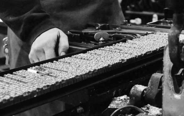

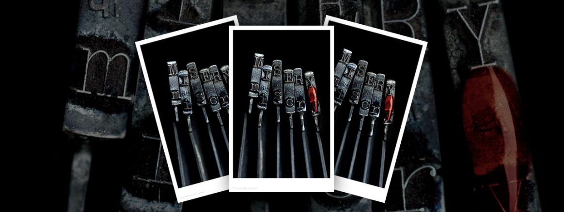
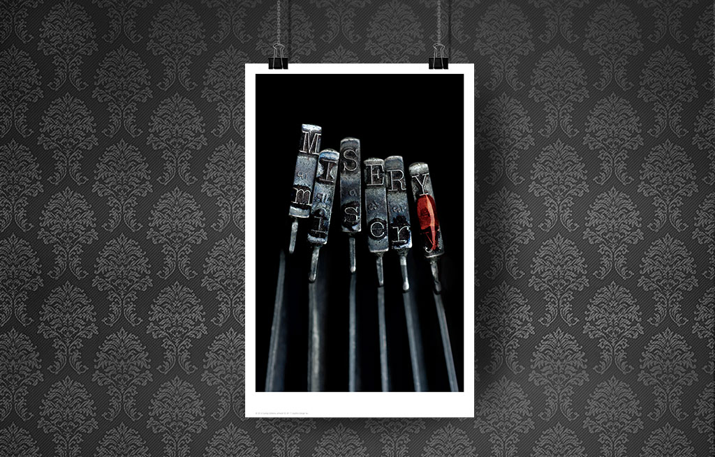
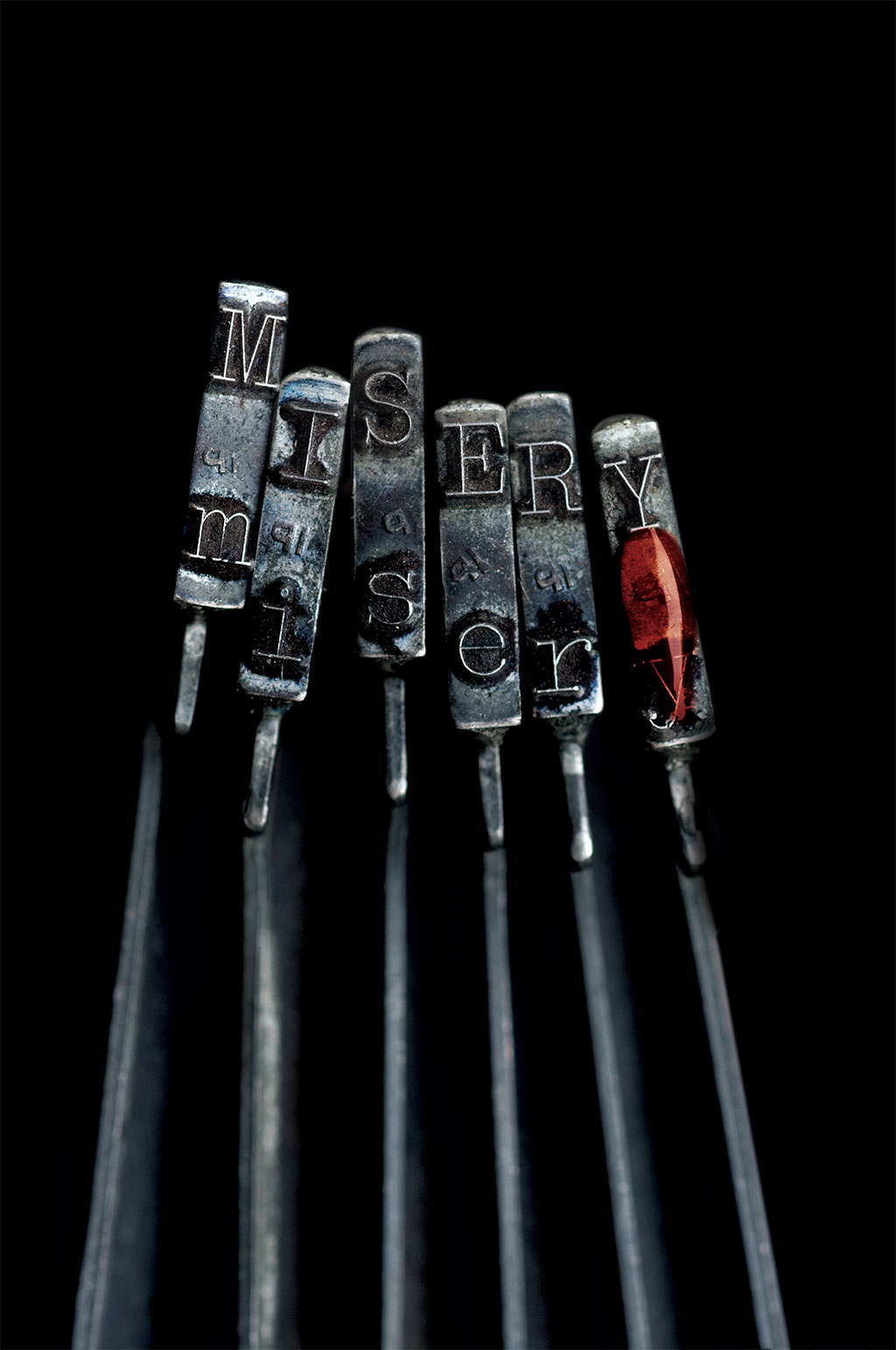
Book designer Catherine Casalino was hired to create several design concepts for the limited edition of Misery by Stephen King. One of the designs she created is the now iconic image of an extreme close-up of the MISERY keys, with a blood drop on the “Y”. This was used on the slipcase of the Artist Gift Edition, as well as the endpapers for that book.
We have been asked several times if there will be a print of this design, and we are excited to announce that we are publishing a beautiful limited edition giclée print, which Catherine has agreed to sign.
The final limitation will be based on pre-order demand, and will not exceed 100 prints.
Please note: This is not a print from The Covers Collection.
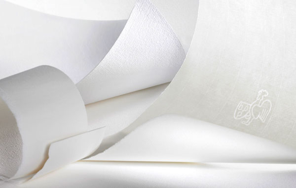
- Museum Quality giclée print.
- Numbered and Signed by Catherine Casalino.
- Limited to no more than 100 copies worldwide.
- Printed on 300 GSM, 100% archival cotton paper.
- Ships flat.
Release Date: January, 2019
Size: 11″ x 17″
We found the process of how this piece was created very interesting, and what follows in a short interview with Catherine Casalino, along with some photographs.
What was your reaction when Paul called and asked you to be involved in his production of Misery?
CC: I was very excited for a number of reasons when Paul Suntup reached out to me about designing a limited edition of Stephen King’s Misery.
First of all, it was a Stephen King book. Getting to work on a marquee author like King is always thrilling for a designer. On top of that, it was Misery, one of King’s best-loved masterpieces, which was adapted into a hugely popular movie. When a project comes to you that is extremely well-known and well-loved, the stakes are very high, because there have already been so many visuals associated with the story— from other book cover designs, to posters, to movie visuals. It’s an exciting challenge to do something new and different that is still true to the essence of the work.
On top of that, I was looking forward to working on the project because I knew from the beginning that I would have a great partner in Paul Suntup as a publisher. During our initial conversations about the project he was 100% open to my ideas and encouraged me to push the envelope in terms of my design proposal for the limited edition.
Had you read Stephen King’s novel, or were you a fan at all of King’s?
CC: Although I had seen the Kathy Bates / James Caan film adaptation of Misery (and was a big fan of other King books, including The Shining and The Stand), I had never read Misery until I was asked to work on this edition. After speaking with Paul and accepting the project, I immediately called my local bookstore, McNally Jackson Books, to see if they had a copy of Misery (which, of course, they did) and I picked it up that same afternoon. I finished the book in 3 days. Even having known the story from the movie, the book was riveting. I was struck by all the amazing visuals and how King’s writing affects you in such a visceral way— you can hear the typewriter keys clicking, and you can smell Annie’s breath. Every few pages I found myself jotting down ideas for the design. The possibilities seemed endless.
How did you come up with this idea, and what other designs had you considered before settling on this one?
CC: The typewriter is omnipresent in the book, so all kinds of typewriter visuals were at the top of my list from the very beginning. It’s also so symbolic of the tension between not only Paul and Annie, the literary genius and his obsessed fan, but also of Paul’s internal conflict of wanting to write one thing but feeling pressure to write in the style that has made him a bestselling author.
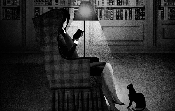
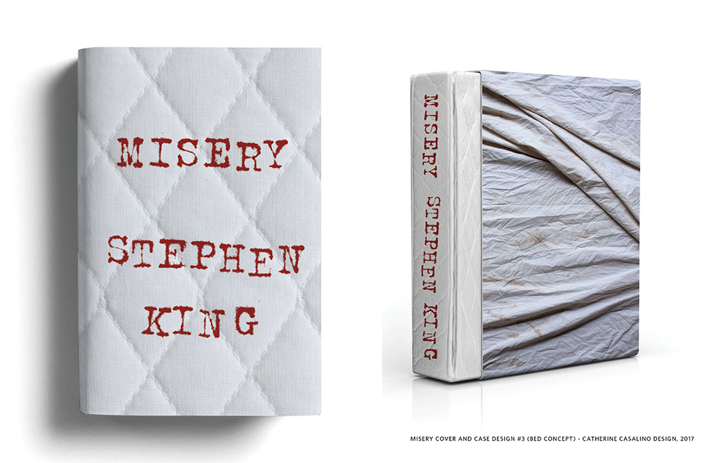
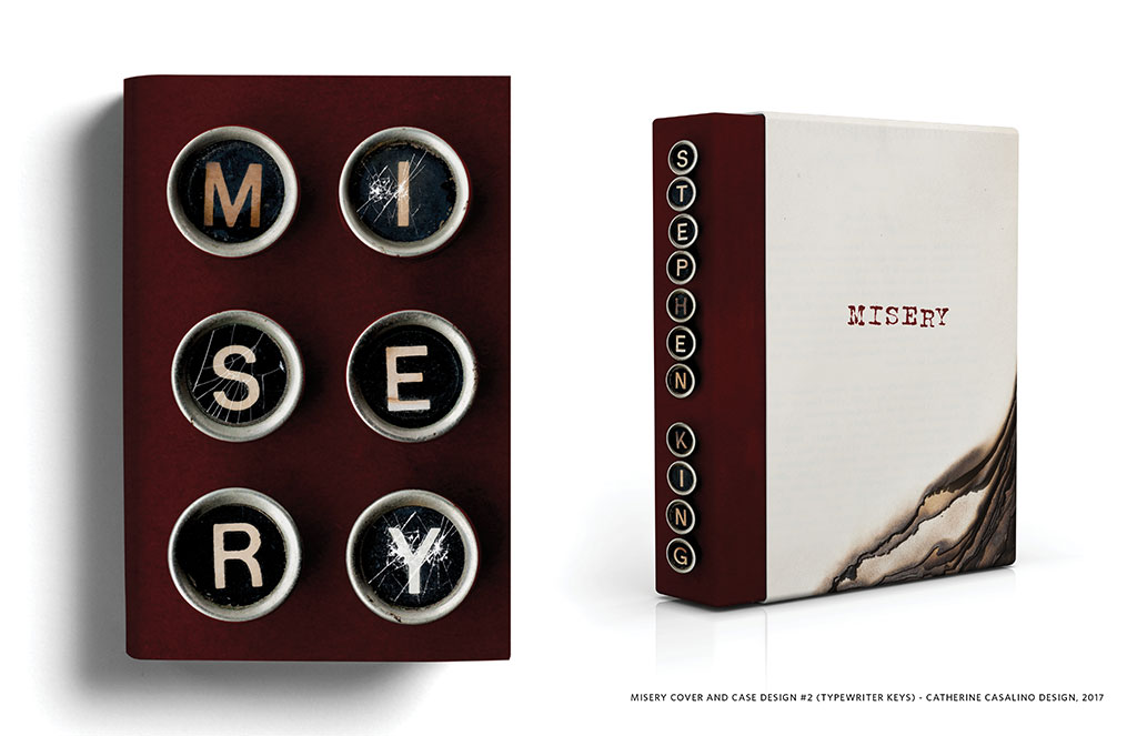
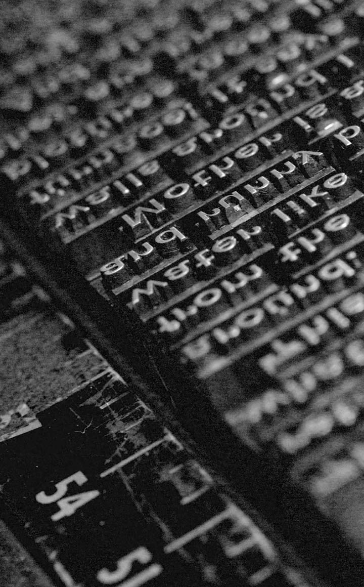
I explored several other ideas using different typewriter elements and other visuals from the book— typewriter keys, the hairpin Paul uses to pick the lock of his room, and a burned manuscript, to name a few. One of my favorite alternate designs was a mattress concept. Paul is trapped in bed for almost the entire book, and that really feeds the claustrophobia and horror you feel as you read. I proposed that the slipcase would be sheets and the book would look like a mattress with the title spelled out in blood-red typewriter letters. We even spoke about using fabric and creating a cushioned box that resembled a mattress.
What made this design work better than the others?
While I loved the mattress concept, I felt like the typewriter hammers really spoke to the heart of the book in a much stronger way. Misery is so terrifying because Annie is not a typical villain. She’s a middle-aged woman who likes romance novels and wears sweaters—a good Samaritan who rescues an injured man. She’s not what most people would picture when you hear the words psychopath or terror. And yet, King turns the beautiful compliment I’m your biggest fan into words that make us shudder. In that same way, a typewriter is not an object that would naturally evoke fear, like a knife or blood. A typewriter is usually a positive symbol of creativity. I wanted to flip that symbol upside down by turning the hammers into something horrifying.
It’s so beautiful and so lifelike, people often ask if it’s a photo or a painting. How exactly did you create this? What methods did you use?
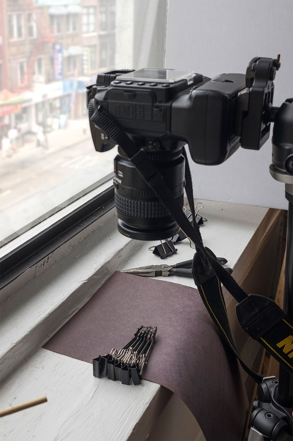
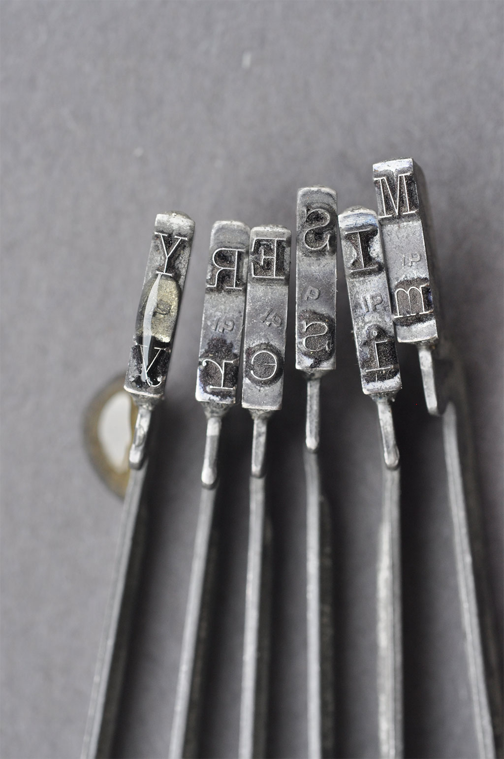
While I’m a graphic designer/creative director by trade, photography was my first love and I really enjoy employing photographic solutions when I can. I bought antique typewriter hammers and keys on eBay and then started photographing them in different ways to see if I could make them look terrifying. After a few test shots, I decided that a shallow depth of field and a macro lens was going to give me the drama I wanted. When you make something much larger than normal, and blur the background, it’s really unsettling. The final image was shot with a 60mm Nikkor lens in natural light. I then darkened the background and shadows and drew out the gritty details in Photoshop to achieve an even more menacing affect.

Do you have anything to add about the blood spatter?
Fun fact! The “blood” was created with a drop of honey that I colorized in Photoshop. The stickiness of the honey allowed me to control the placement of the drop with a high level of precision, which was important since the typewriter hammers are so tiny!

Design by Catherine Casalino Design, Creative Direction by Paul Suntup/Suntup Editions.
Paul Michael Kane
As both a graphic designer and a professional photographer – and a Stephen King fan – I really enjoyed reading this interview. I just ordered the print and can’t wait to frame and hang it with my SK collection. Congratulations all around for an amazing, finished product. So happy I was able to snag one after itital orders sold out.
Paul Suntup
Thanks for the order Paul, and for your comment. It is much appreciated!