


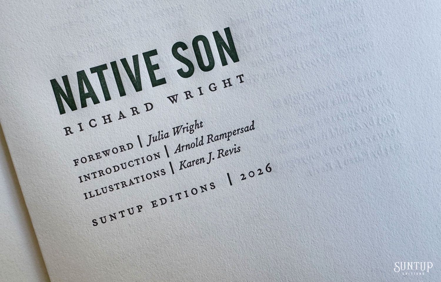
Native Son Richard Wright
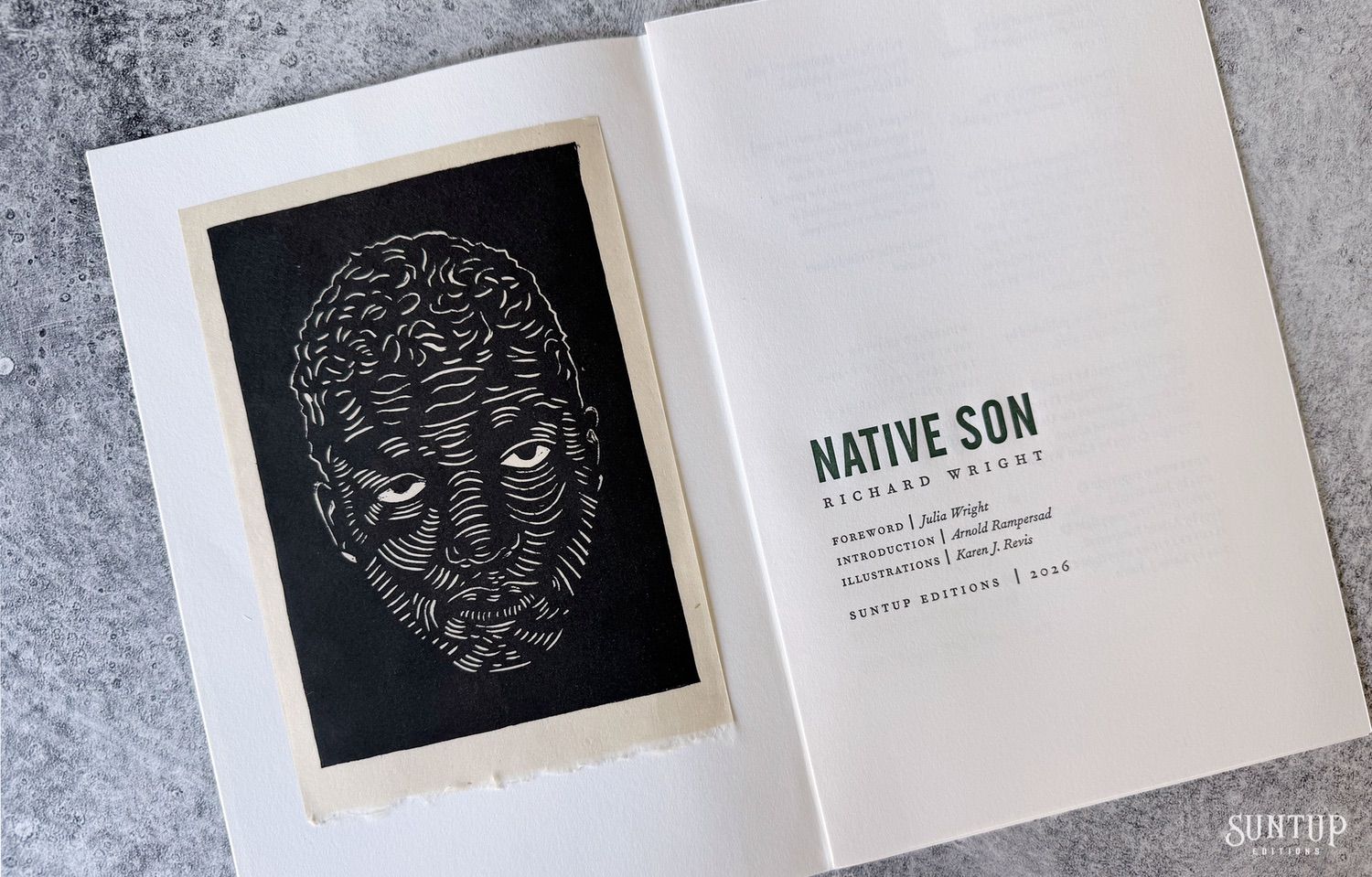
Linocuts by Karen J. Revis
Foreword by Julia Wright
Introduction by Arnold Rampersad
Set in Chicago in the 1930s, Native Son tells the story of Bigger Thomas, a young Black man caught in a downward spiral after killing a young white woman in a brief moment of panic. Written with the distinctive rhythm of a modern crime story, Native Son is both a condemnation of social injustice and an unsparing portrait of the Black experience in Depression-era America, revealing the tragic effect of poverty, racism and hopelessness on the human spirit.
First published in 1940, The New Yorker called Native Son by Richard Wright “the most powerful American novel to appear since The Grapes of Wrath.” Wright’s protest novel was an immediate best-seller, selling over a quarter million hardcover copies within just three weeks of its publication by the Book-of-the-Month Club.
One of the earliest and most influential novels to confront America’s racial divide through the lived realities imposed upon Black Americans by a dominant white society, Native Son marked a decisive rupture in American literature. Its publication not only secured Richard Wright’s place as the most prominent Black writer of his generation, but also positioned him as a defining voice on African-American life and experience.
In the 1963 essay “Black Boys and Native Sons,” Irving Howe observed, “The day Native Son appeared, American culture was changed forever. It made impossible a repetition of the old lies … [and] brought out into the open, as no one ever had before, the hatred, fear, and violence that have crippled and may yet destroy our culture.” Newsweek referred to Wright’s story as “a novel of tremendous power and beauty” while American literary critic and professor Henry Louis Gates, Jr. has stated, “If one had to identify the single most influential shaping force in modern Black literary history, one would probably have to point to Wright and the publication of Native Son.”
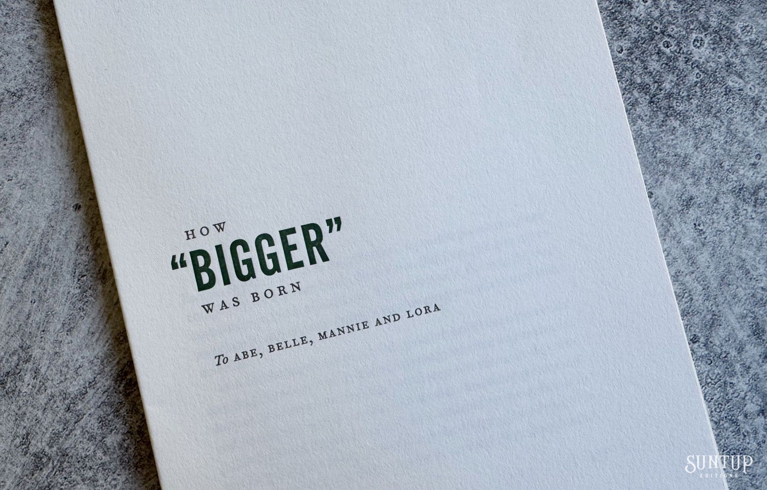
In 1991, Native Son was published for the first time in its complete and unexpurgated form by the Library of America, restoring the novel as Richard Wright originally intended it to be read. Our edition is faithfully set from this definitive text, and includes the author’s essay, “How ‘Bigger’ Was Born,” further illuminating the novel’s genesis and evolution. Also included is an introduction by Arnold Rampersad, as well as a new and exclusive foreword by Julia Wright, the daughter of the author.
Further solidifying its continued relevance, Native Son is number 27 on Radcliffe’s Rival 100 Best Novels List, the Modern Library placed it at number 20 on its list of the 100 Best Novels of the 20th Century, Time magazine included the novel in its 100 Best English-Language Novels from 1923 to 2005, and it is included in The Atlantic‘s prestigious list of Great American Novels.
With Native Son, author Richard Wright permanently altered the cultural landscape, rendering the nation’s longstanding evasions untenable and forcing into public view more starkly than ever before, the fear, violence and hatred that can find itself embedded within American society.
About The Edition
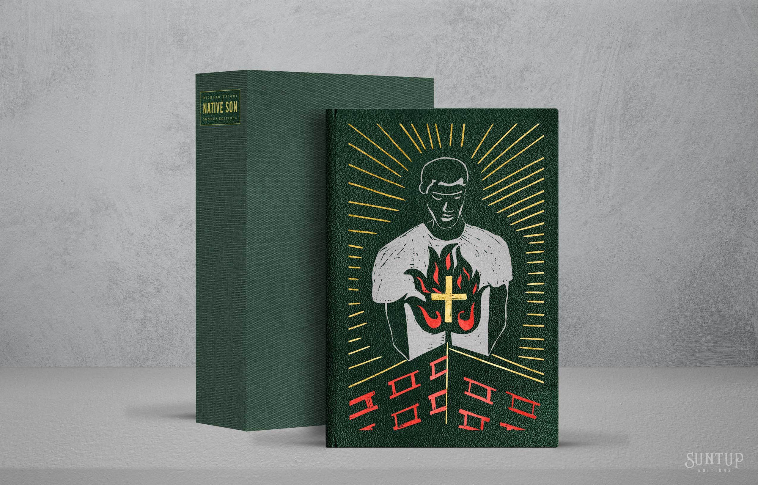
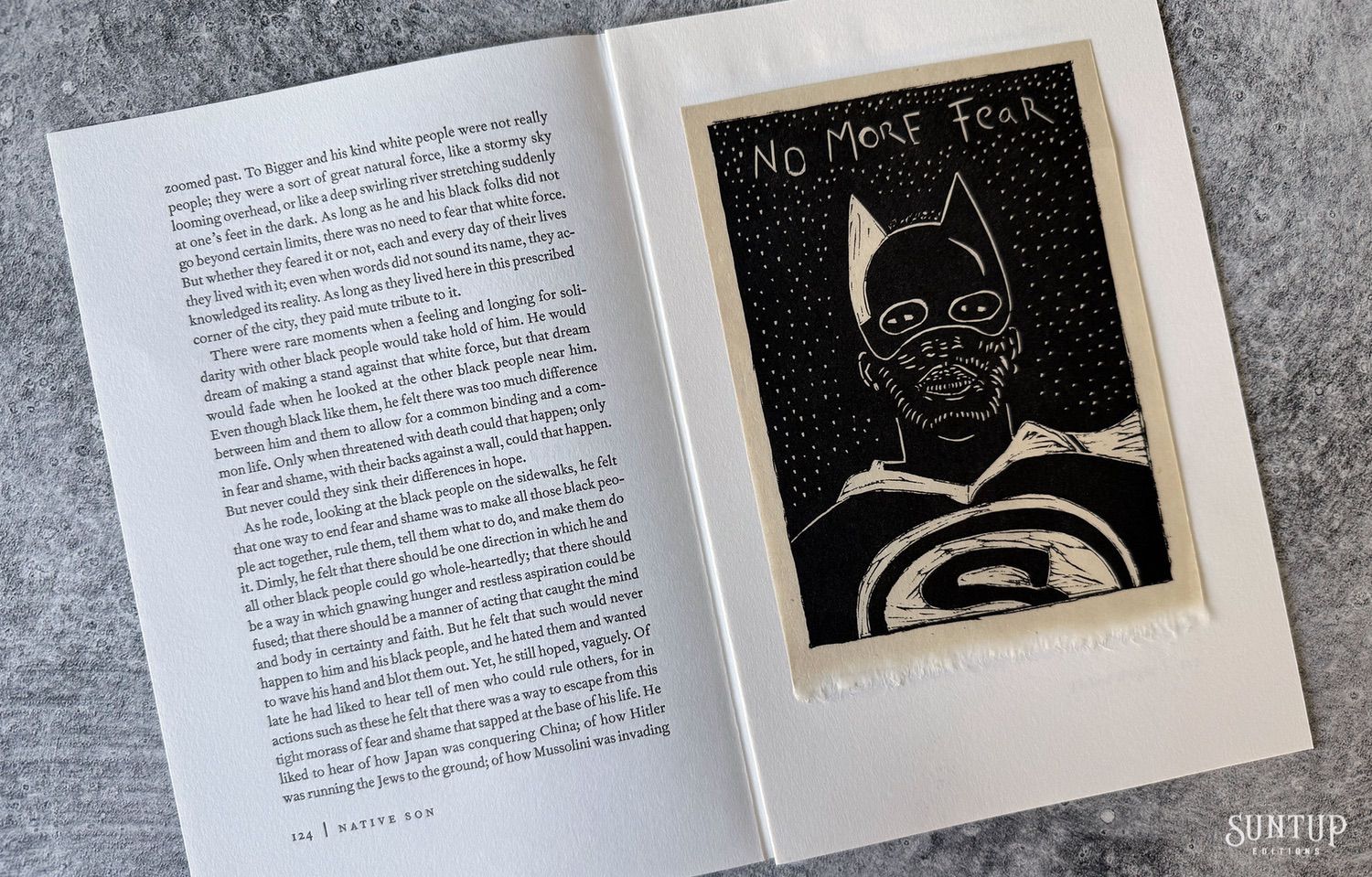
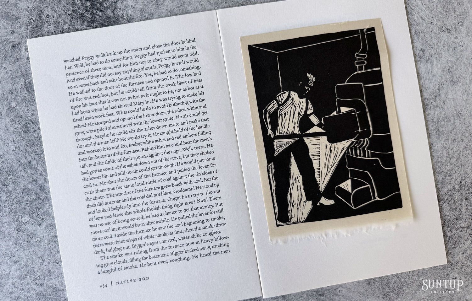
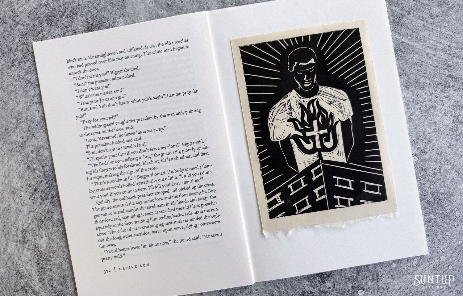
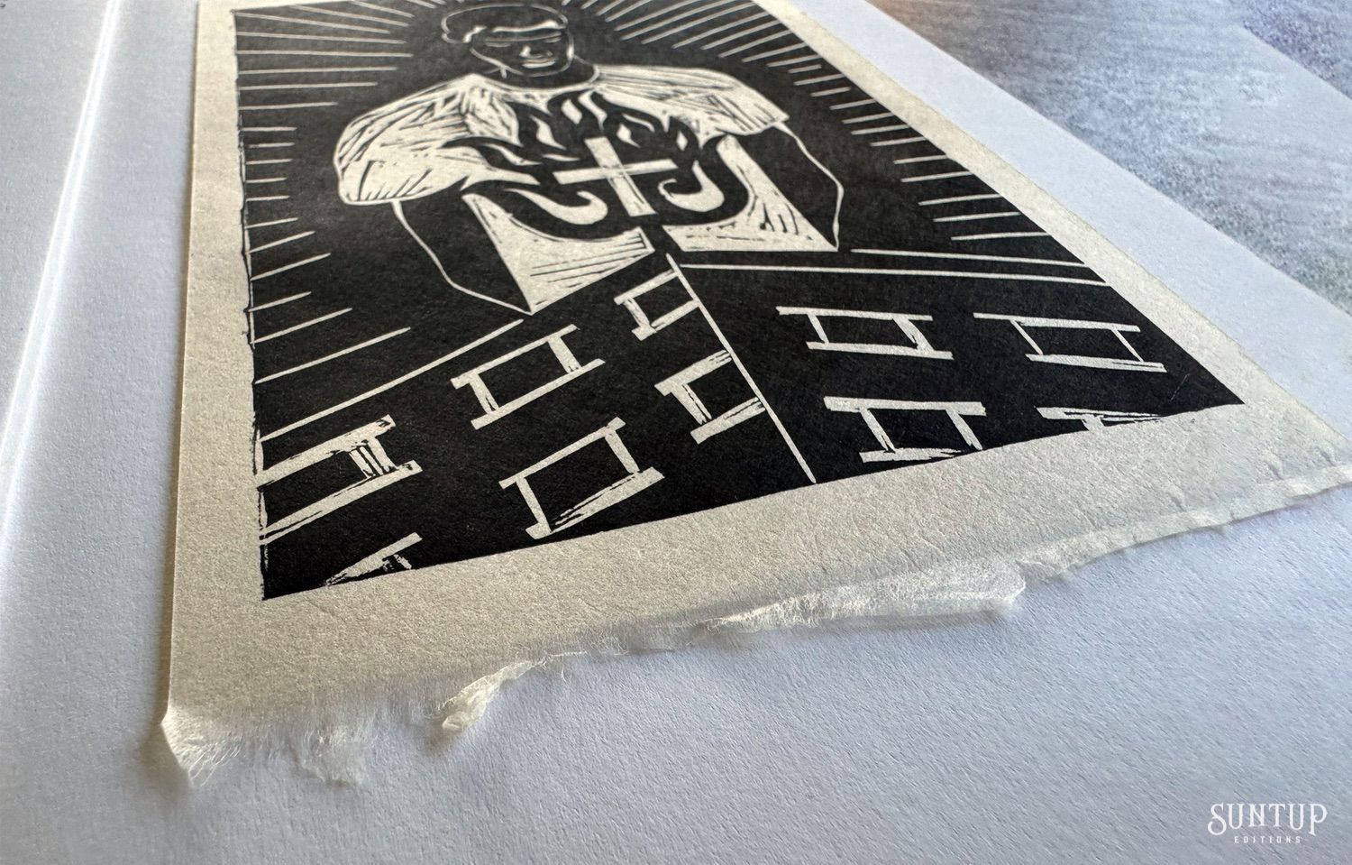
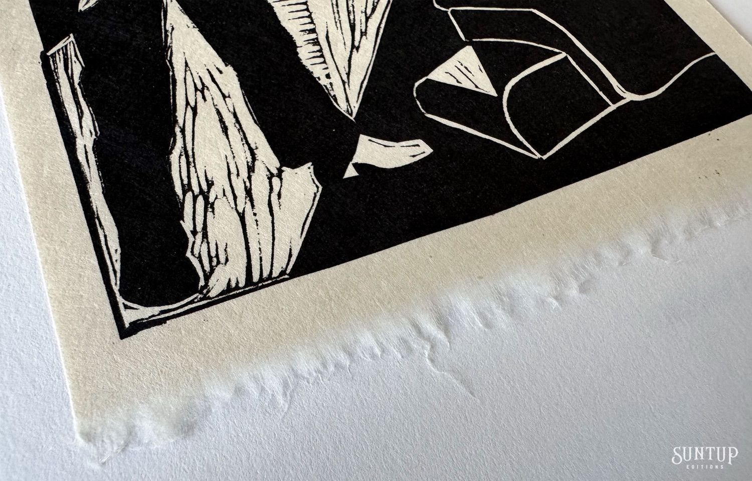
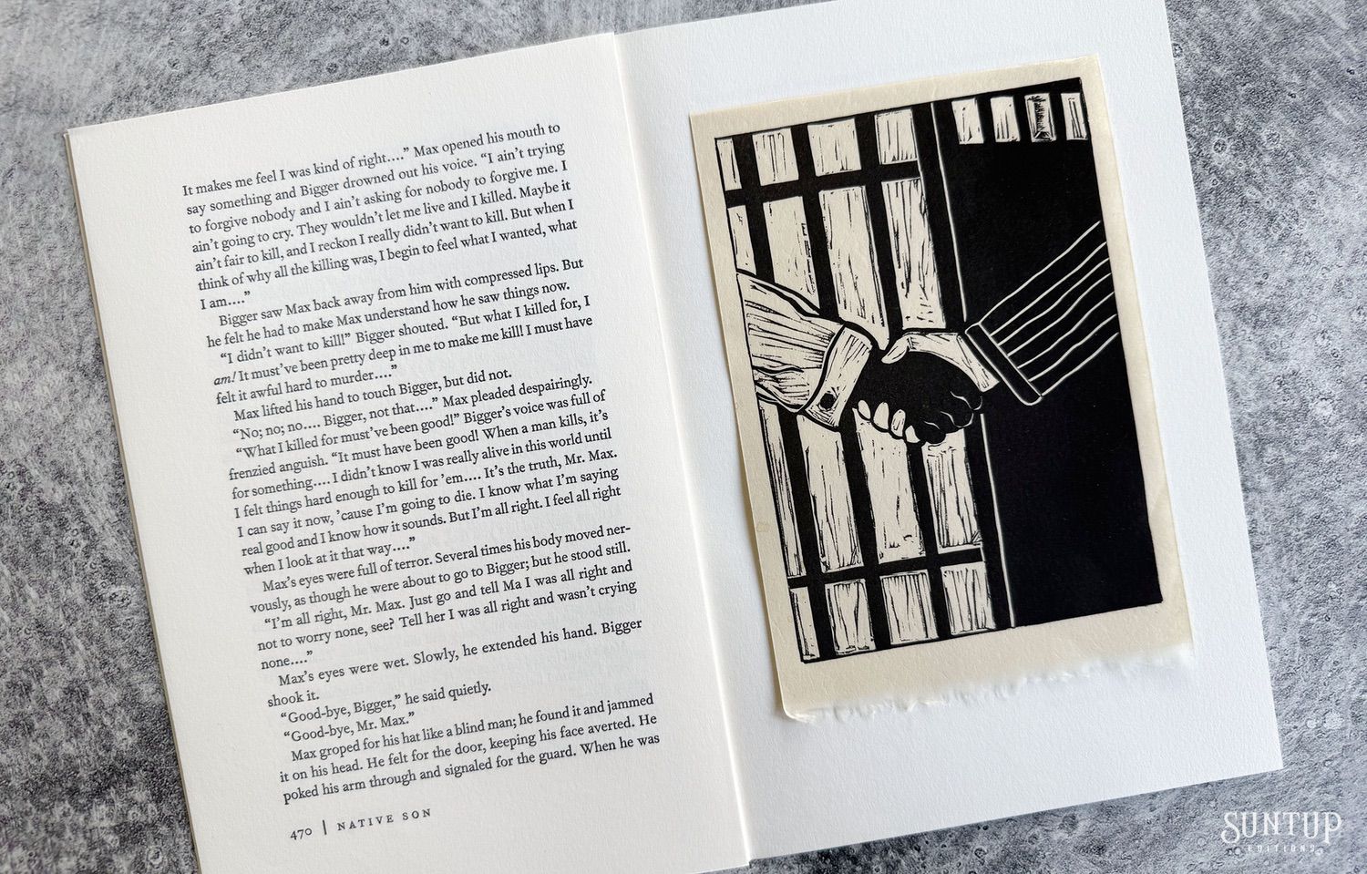
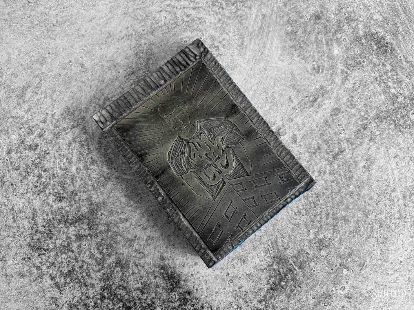
Our edition of Native Son by Richard Wright is presented in two states. The edition measures 6” x 9” and features eight linocuts by Karen J. Revis, a foreword by Julia Wright and an introduction by Arnold Rampersad. The linocut illustrations are printed from the blocks on Kitakata handmade paper and are tipped on. Designed by award-winning designer Jason Dewinetz. The text pages are set in Monotype Fournier with Alternate Gothic for display, and are printed letterpress by Scott Vile at The Ascensius Press in Buxton, Maine on Mohawk Via Vellum.
A Note on the Typography
For Native Son, the pairing of Monotype Fournier and Alternate Gothic creates a striking typographic tension that mirrors the novel’s psychological and societal conflicts. Monotype Fournier, a refined 18th-century transitional serif, carries an elegance and precision reflective of Enlightenment ideals—its delicate contrast and ornamented forms evoke a structured, hierarchical world. In contrast, Alternate Gothic, a bold and compressed sans-serif from the early 20th century, exudes urgency and modernity, its no-frills geometry pressing forward with raw, condensed energy. Together, they encapsulate the book’s dualities: the oppressive weight of systemic structures and the explosive force of individual rage. Fournier lends an ironic civility, while Alternate Gothic shouts, echoing Bigger Thomas’s claustrophobic world and the brutal clarity of Richard Wright’s prose.
Numbered Edition
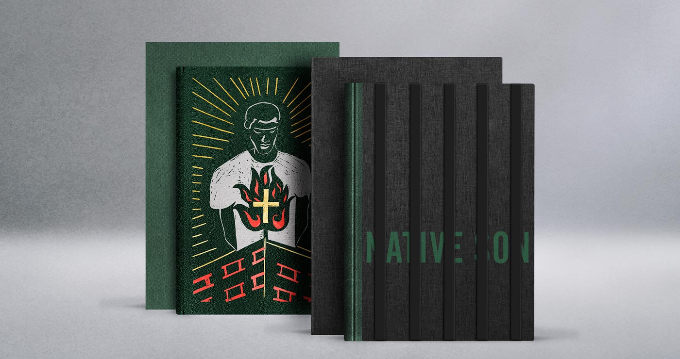
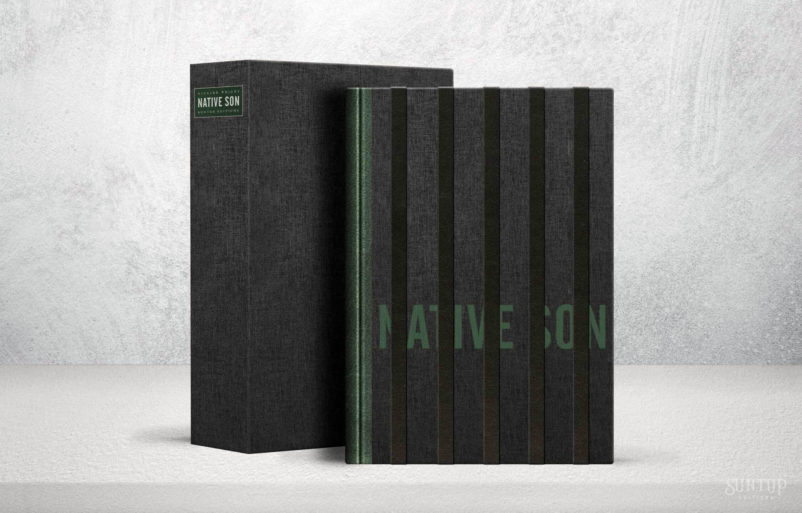
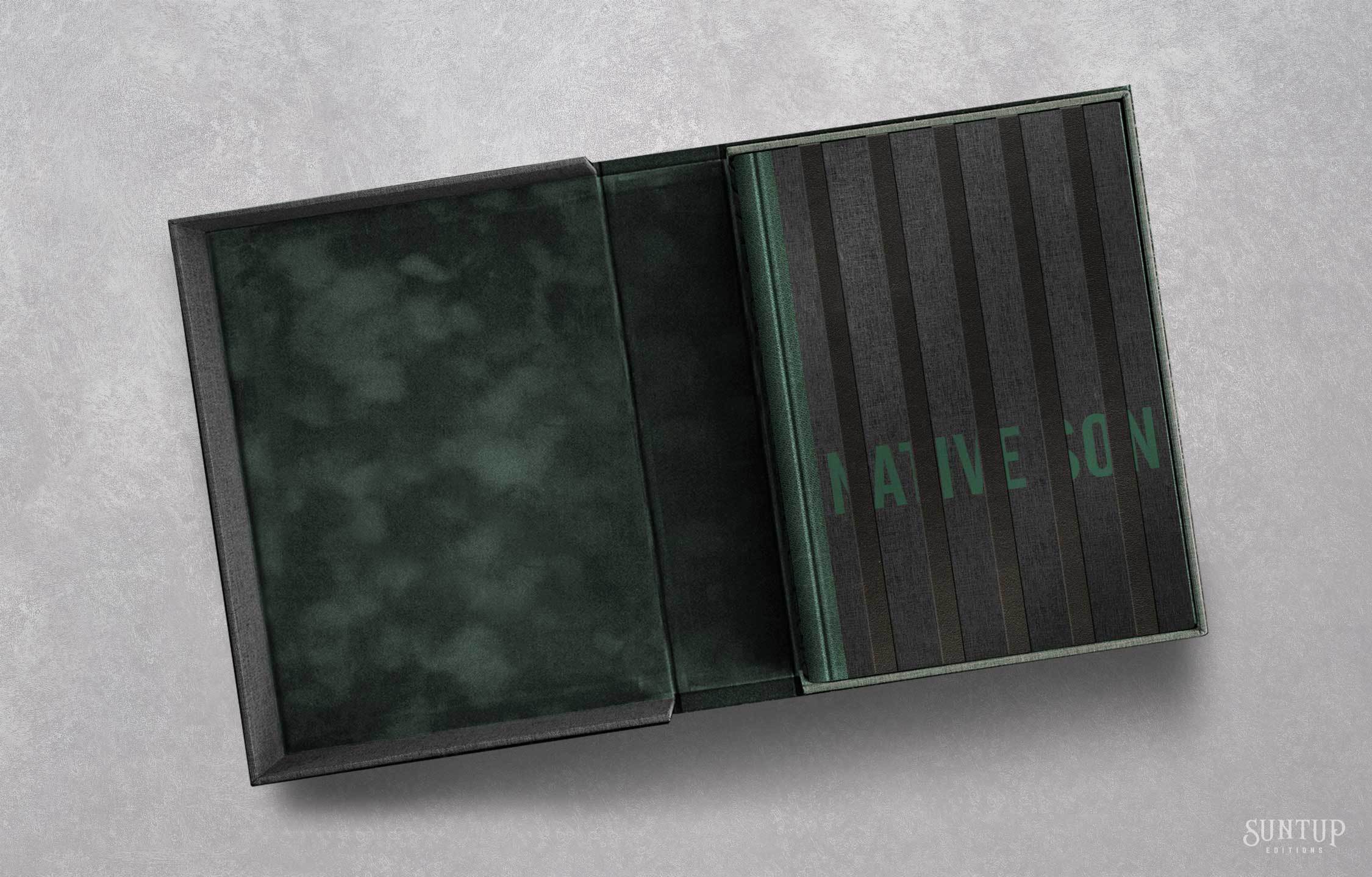
Pre-orderThe Numbered edition of 250 copies is a quarter goatskin binding designed to reflect the central conflict of Native Son—a struggle for identity within a system built to confine.
Vertical onlays of black full-grain fine split goatskin are affixed to the front cover. The title, bold but partially hidden, suggests a voice attempting to break through constraint—present, yet obstructed. This interplay of text and barrier speaks to Bigger Thomas’s experience: a life defined not solely by his actions, but by the boundaries imposed upon him by race, class, and fear. The design resists illustration in favor of metaphor, echoing the novel’s emotional and social weight through form and material.
Endsheets are Hahnemühle Bugra and the cloth endbands are handmade. The edition is housed in a cloth covered clamshell enclosure with velour lined trays. It is printed letterpress on Mohawk Via Vellum with all illustrations printed from the original linocut blocks on Kitakata handmade paper. The edition is signed by Julia Wright, Arnold Rampersad and Karen J. Revis.
Lettered Edition
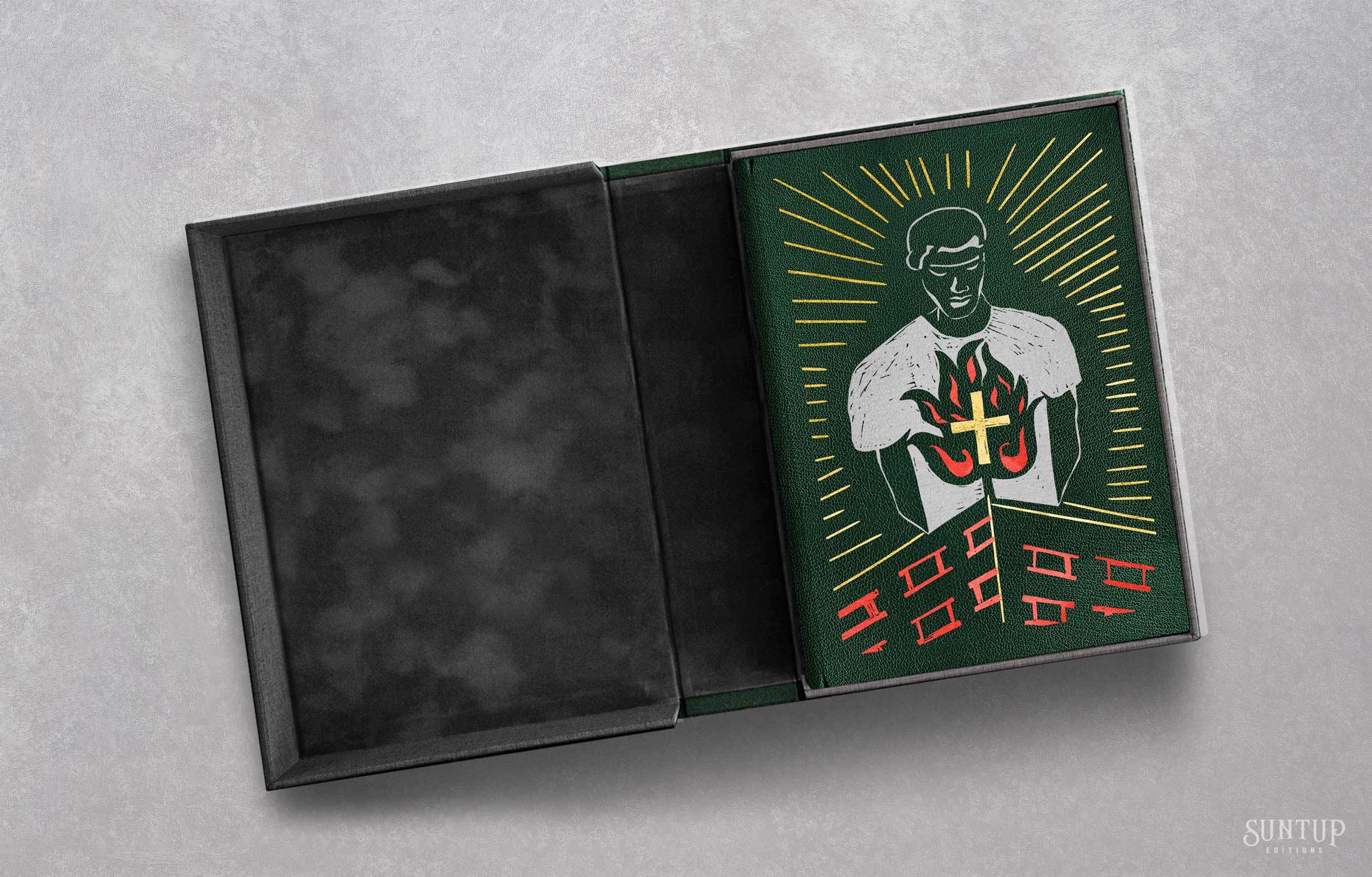
The Lettered edition is limited to 26 copies and is a full goatskin binding which features a striking foil-blocked portrait of Bigger Thomas on the front cover, adapted from one of the original linocuts commissioned for this edition. Rendered in three colors, the image introduces an instance of color in an otherwise monochrome design. While the interior linocuts are printed in stark black ink, reinforcing the bleakness and moral gravity of the narrative, the cover offers a moment of heightened visual presence.
Endsheets are handmade for this edition by renowned paste paper artist Marie Kelzer. The edition is housed in a cloth covered clamshell enclosure with velour lined trays. It is printed letterpress on Mohawk Via Vellum with all illustrations printed from the original linocut blocks on Kitakata handmade paper. The edition is signed by Julia Wright, Arnold Rampersad and Karen J. Revis.
About the Author

About the Collaborators
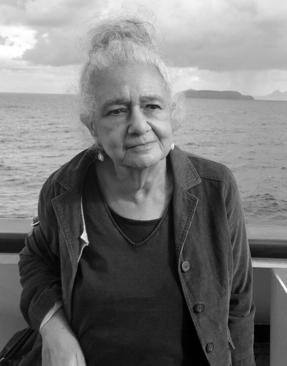
Julia Wright
Julia Wright is the elder daughter of Richard Wright and literary executor of his estate. She is a journalist published in Europe, Africa, Latin America and the USA. Also a poet, she is currently working on a memoir.

Arnold Rampersad
Arnold Rampersad, the Sarah Hart Kimball Professor Emeritus in the Humanities at Stanford University, has also taught at Princeton, Columbia, and Rutgers Universities. His books include The Life of Langston Hughes (two volumes); biographies of W. E. B. Du Bois, Jackie Robinson, and Ralph Ellison; and, with Arthur Ashe, Days of Grace: A Memoir. Among his numerous awards and honors are a MacArthur Foundation fellowship in 1991 and the National Humanities Medal, presented at the White House in 2011.

Karen J. Revis
Karen J. Revis is a New York-based printmaker. She is a member of the Black Women of Print collective. As part of the collective, Karen’s work has been acquired by the Whitney Museum of Art, The Metropolitan Museum of Art, University of Knoxville, Tenn, Cincinnati Art Museum, Milwaukee Art Museum, and Jordan Schnitzer Collection, Portland, OR. Her work can also be found in the permanent collection of the Yale Gallery as well as other esteemed private collections. Two of Karen’s prints were selected in 2020 by Colossal Media as the first in their Represent: Black Arts project, with murals in New York City and Los Angeles. Karen’s work is featured in the 2023 Spring issue of Architectural Digest and in issue 22 of Pressing Matters, 2023.
Matching Numbers & Letters
A Matching Pre-Order email is sent to owners of our previous publication, The Hellbound Heart with a designation of 1-250 at 9:00 A.M. PT on the day of announcement. If you did not receive the email, contact us here. If your order is not received before the deadline, your designated number or letter will be assigned to the new owner.
Published editions may differ slightly from mockups and prototype designs.
Illustrations © 2025 by Karen J. Revis