
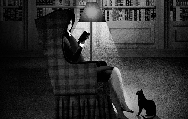

We love the words. Or more specifically, the right words strung together to make a sentence. What’s ‘right’ though? Well, if you read it, and feel somehow changed after reading it, then I would say it’s right. I have loved poetry for a long time. If there were ever the perfect choice of words, placed together in the most perfect way, you will find it in poetry.
There are many poetic lines in Stephen King novels. Take this, from Christine, “…but the dunelike drifts rolling across lawns all up and down the street like the backs of great buried beasts confirmed it.”
And another, from The Dead Zone, “The warm October wind gusted strongly and great shades of light and shadow seemed to pass across the world.”
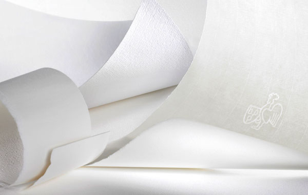
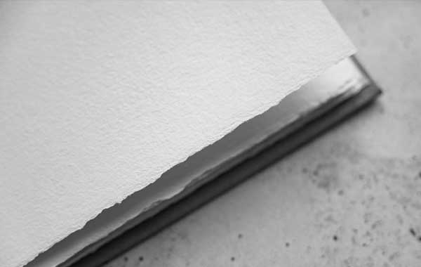
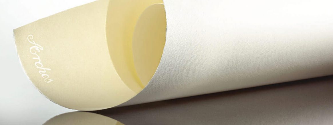
I think I knew what paper I wanted to print Misery on before I knew I would be publishing an edition of the novel. I didn’t know what the paper was called, but I figured I would know when I saw it.
I went through about twelve different types of paper when making the selection. For my first run around, I didn’t look at which mill they came from. I just felt them more than anything else, and when I settled on the one I would use for the Lettered edition, I knew instantly it was the right choice. And we went through a similar process for the Numbered and Artist Gift editions.
Something kind of wonderful happens when you put ink to paper. And when paired with a paper that moves you in some way, it creates a unique reading experience.
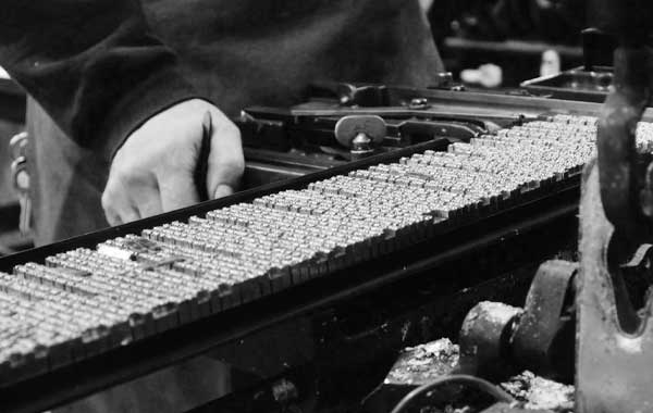
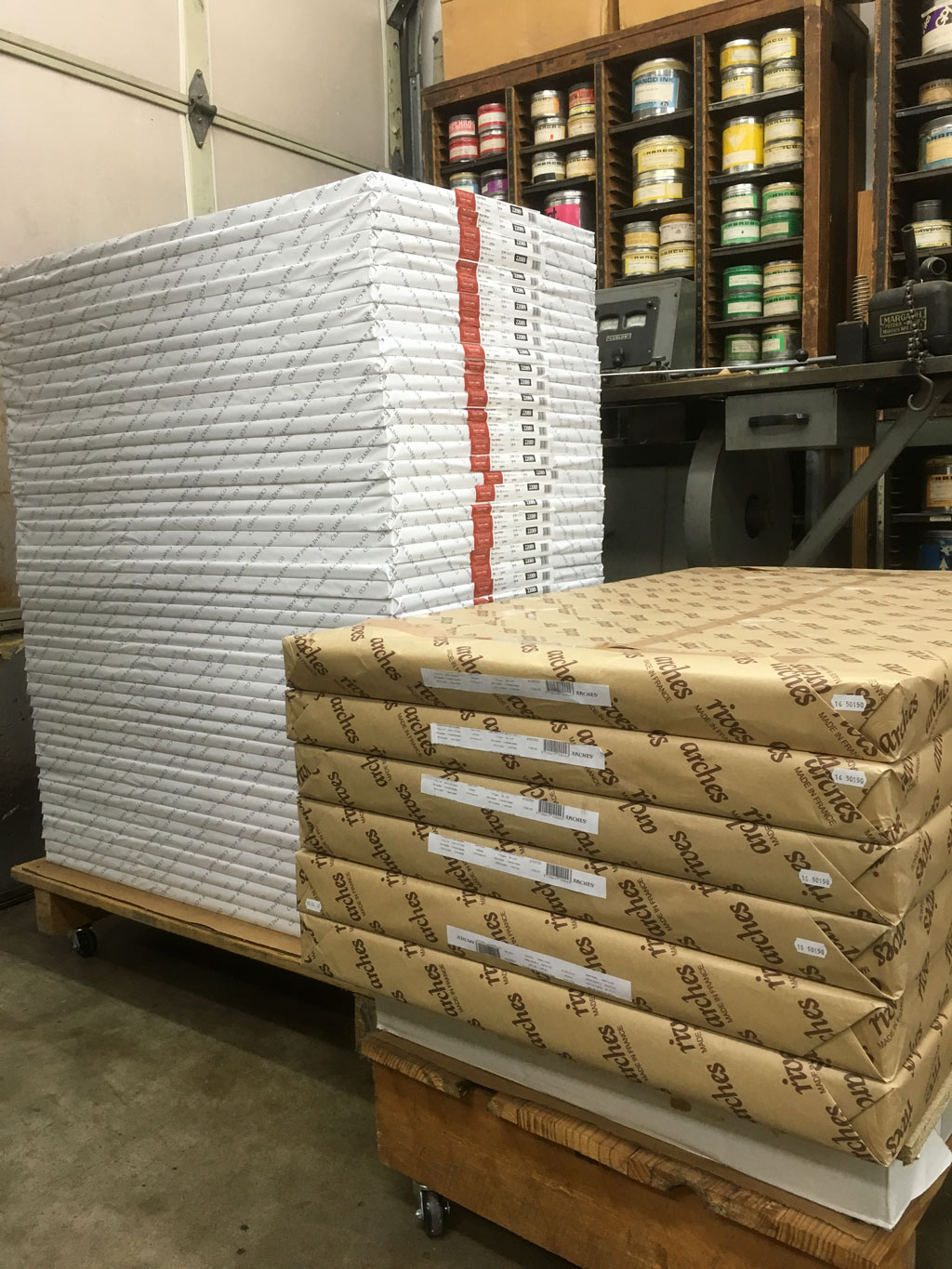
Here’s a ‘before’ shot. Standby for the ‘during’ coming soon.
Arches photo by Arches Paper
Adam
Great article, Paul. I couldn’t agree more about the words King uses and how they can change how you feel. His ability to write prose poetry is the very reason I give someone who asks me how I can read hundreds of pages about a killer car.
Paul Suntup
Thanks Adam!