


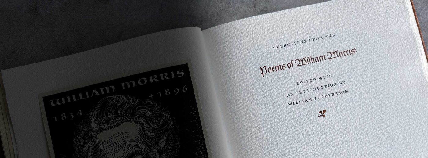
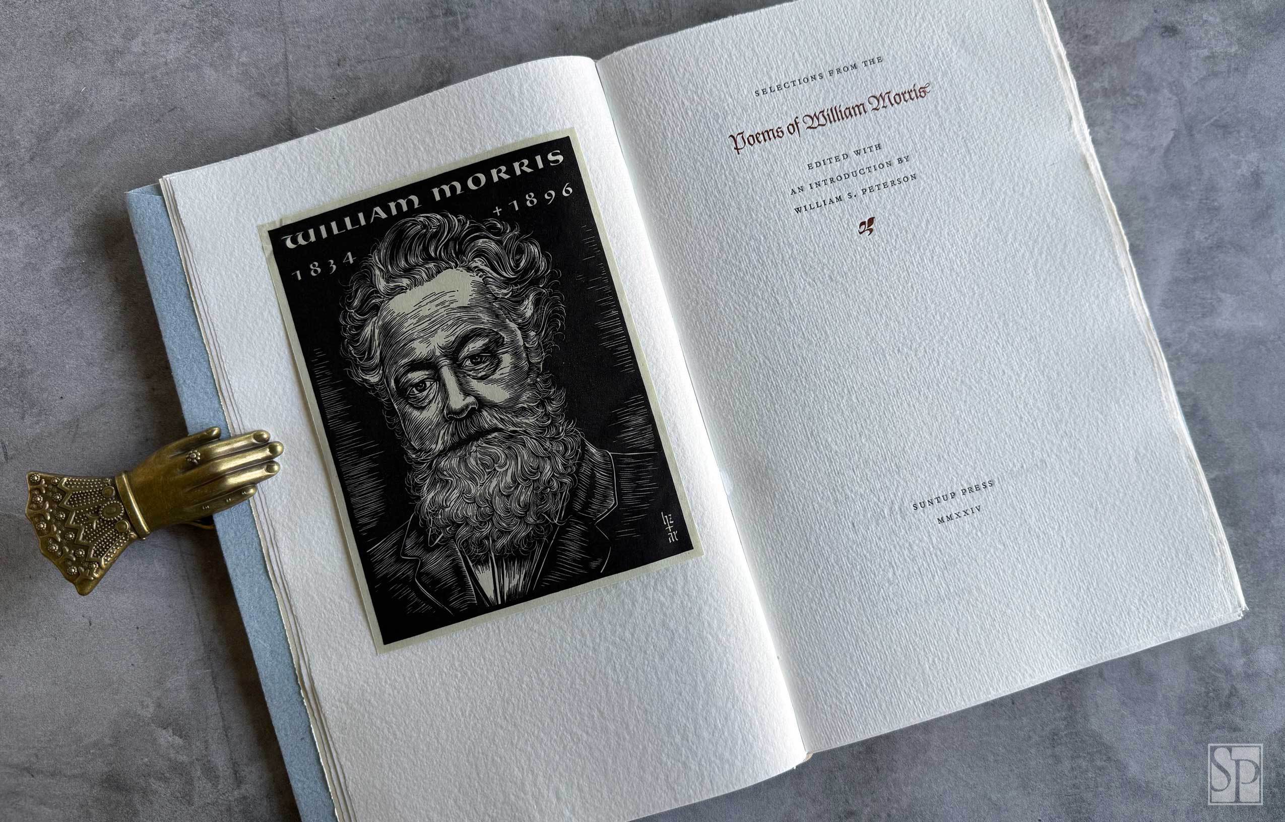
Selections from the Poems of William Morris William Morris
Edited with an introduction by William S. Peterson
Published under the Suntup Press imprint
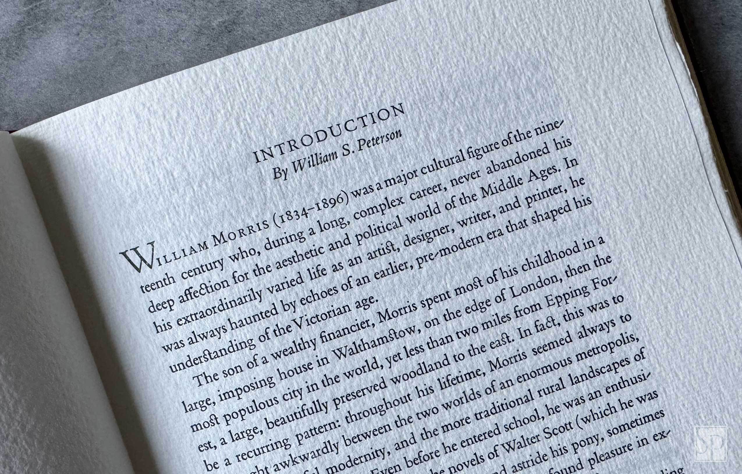
William Morris (1834–1896) was an important cultural figure of the nineteenth century whose long and complex career was shaped by his deep affection for the aesthetic and political world of the Middle Ages. His founding of the Kelmscott Press in 1891 revolutionized fine printing and established principles of craftsmanship and design that continue to influence fine press publishing today.
In his extraordinarily varied life as an artist, designer, writer, and printer, he was always haunted by echoes of an earlier, pre-modern era that shaped his understanding of the Victorian age. Because his activities were so wide-ranging, it is easy to forget that Morris continued to write verse until his final years and saw it as an essential element in his attempt to recreate a largely vanished culture of the English countryside. The poems in this volume, with their powerful medieval overtones, offer a fascinating record of his commitment to that distant rural world.
About The Edition
This publication is issued under the Suntup Press imprint with no rights attached.
The edition is edited—and includes an introduction—by William S. Peterson, whose scholarship has shaped both the modern understanding of William Morris and the study of fine printing and design.
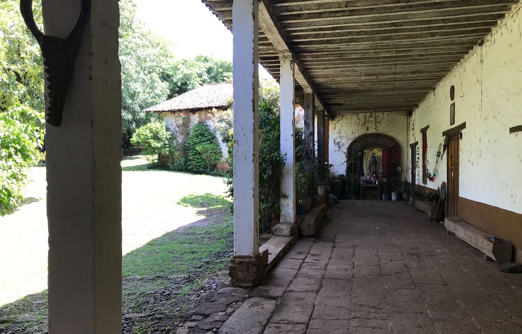
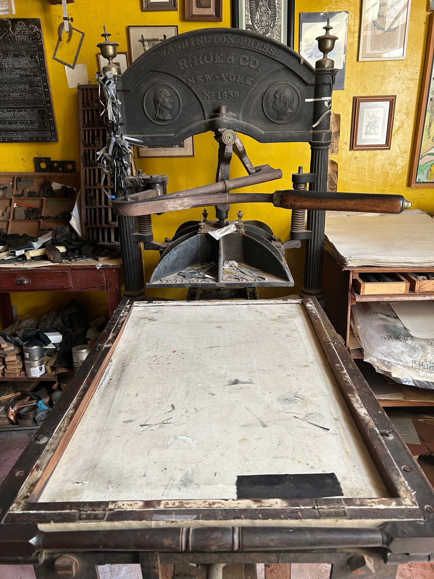
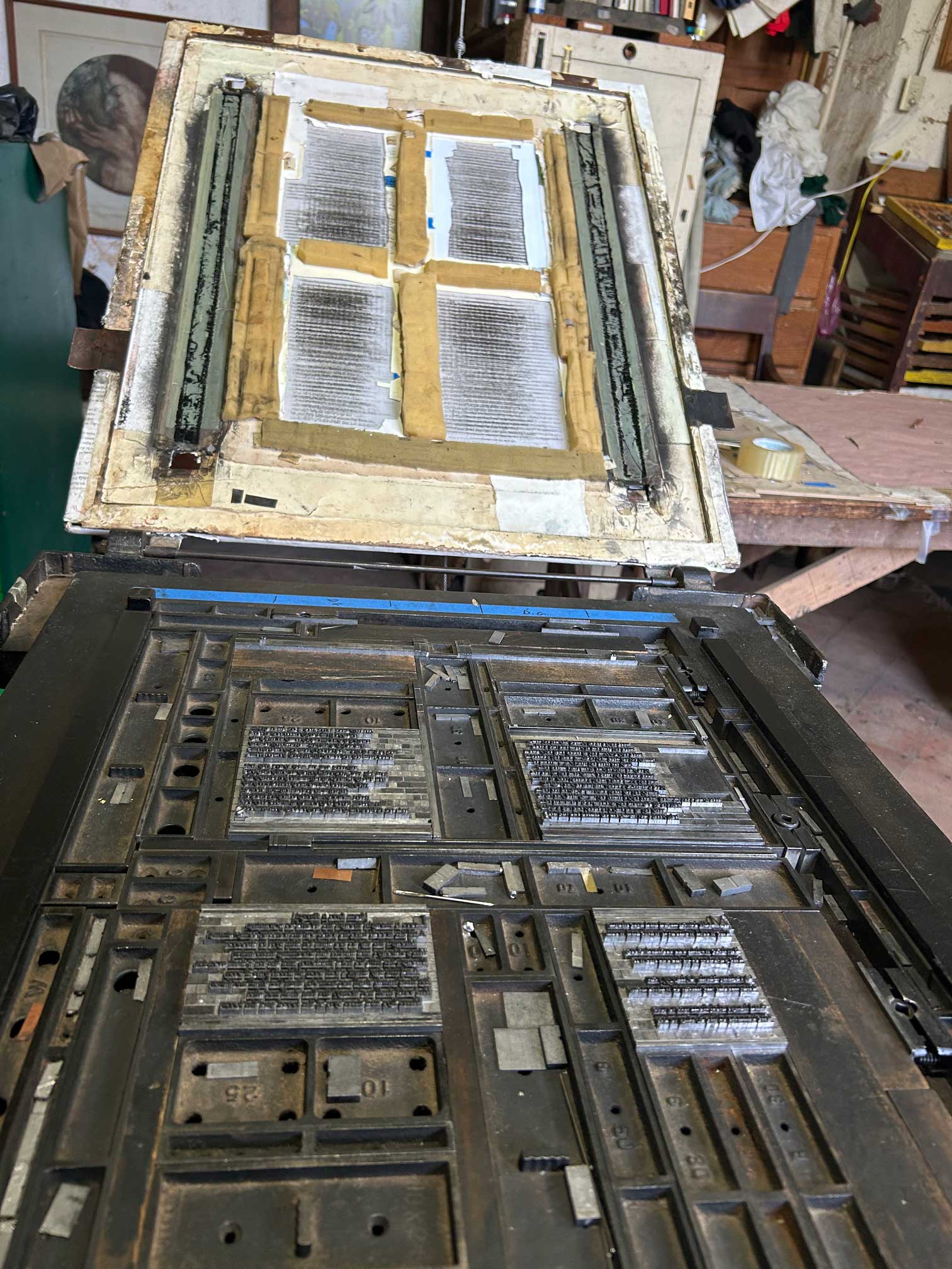
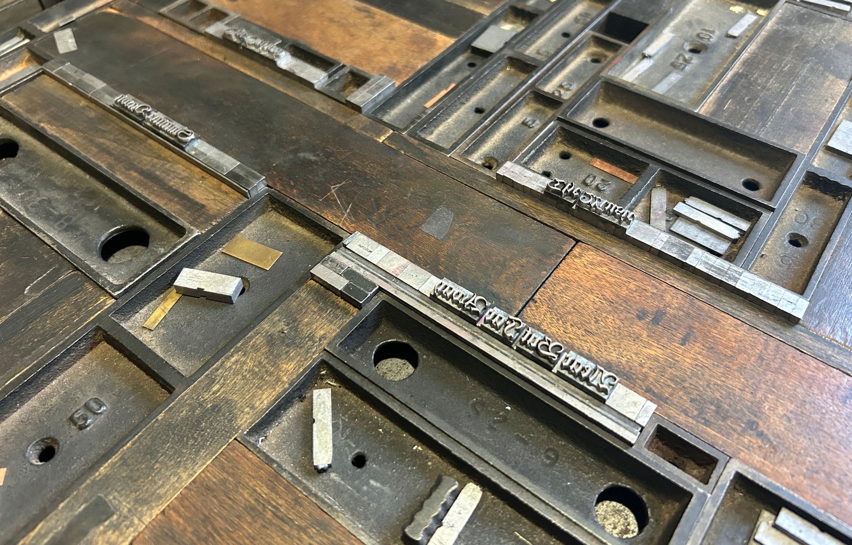
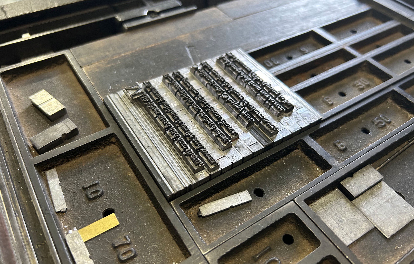
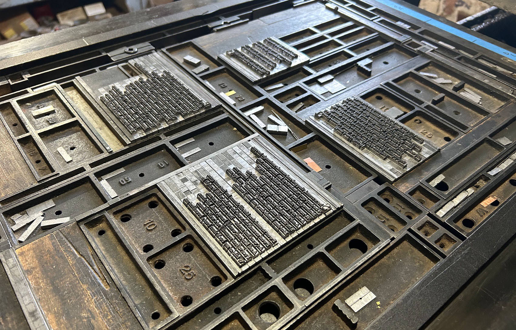
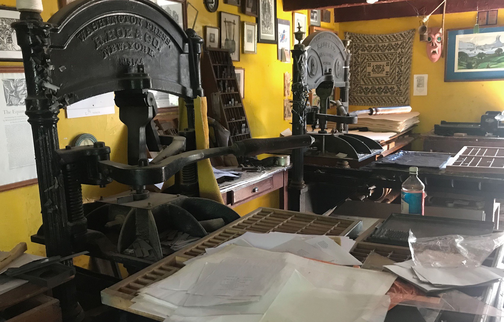
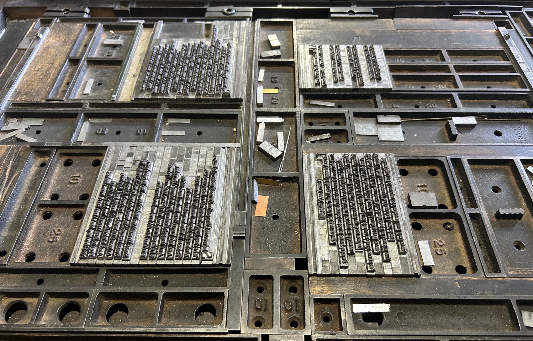
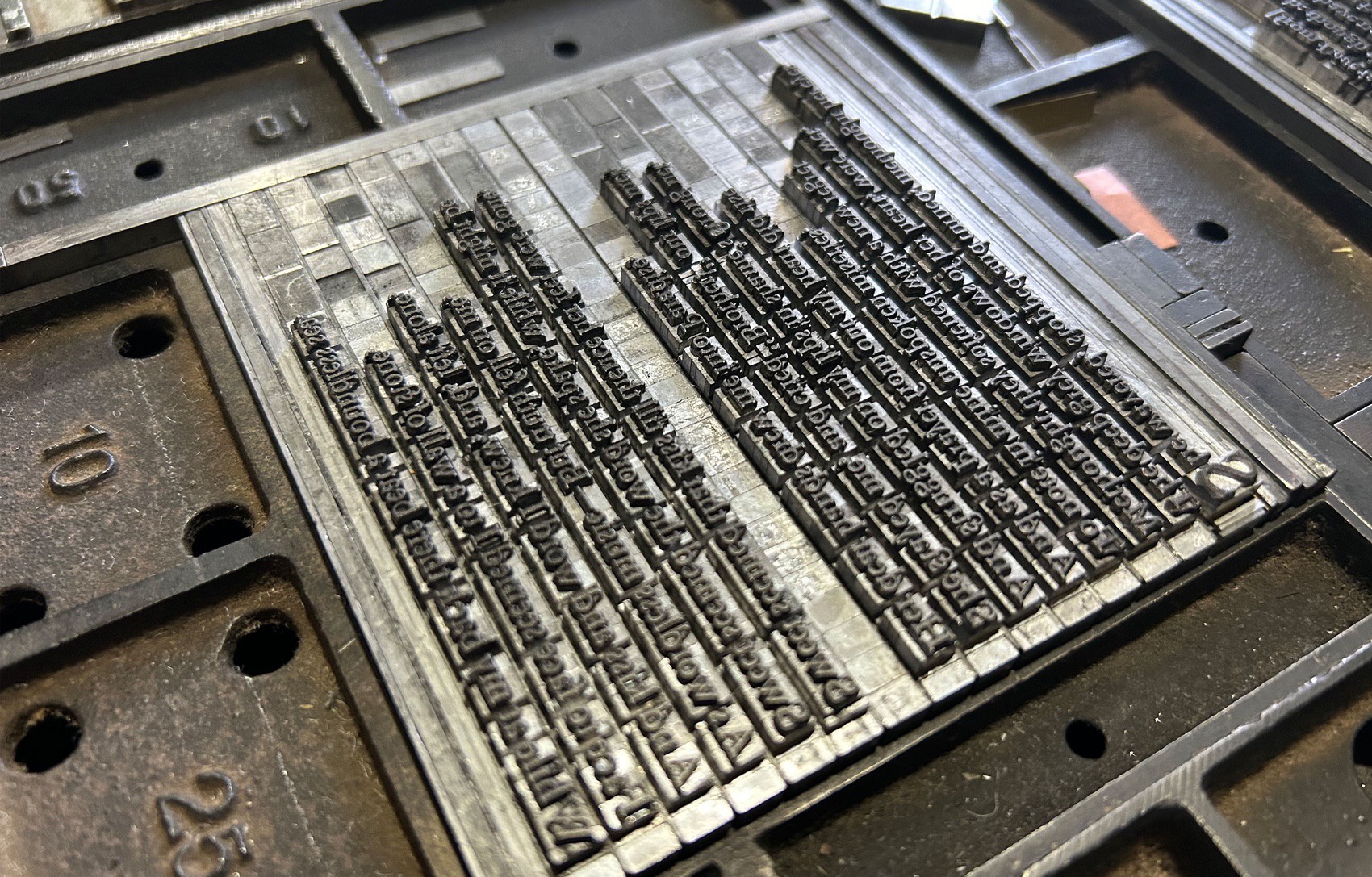
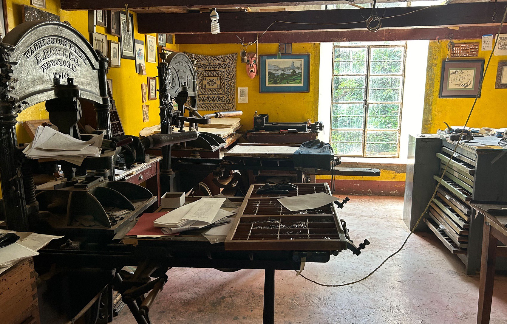
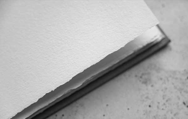
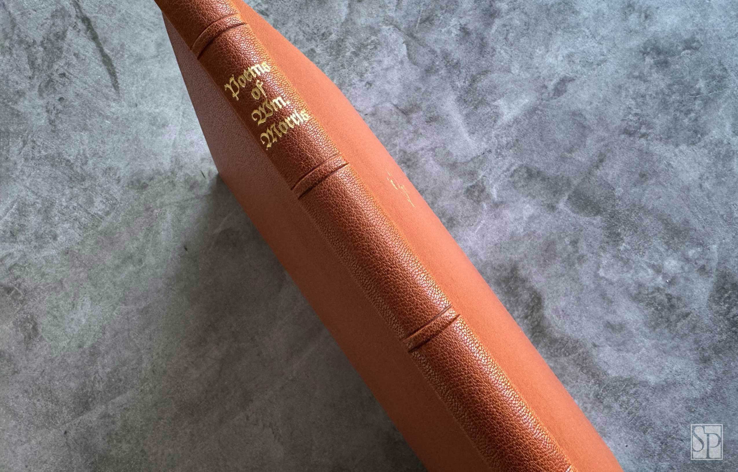
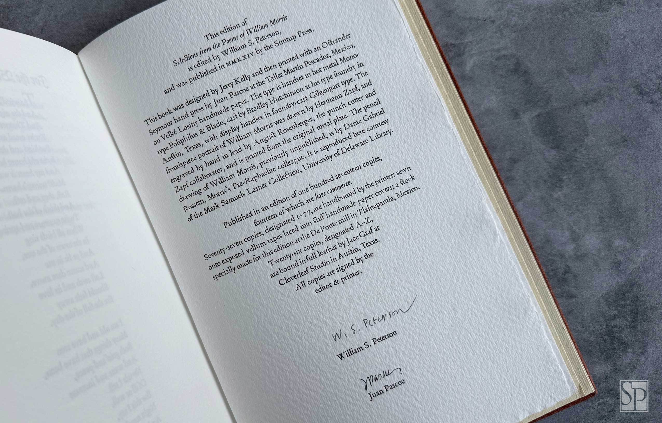
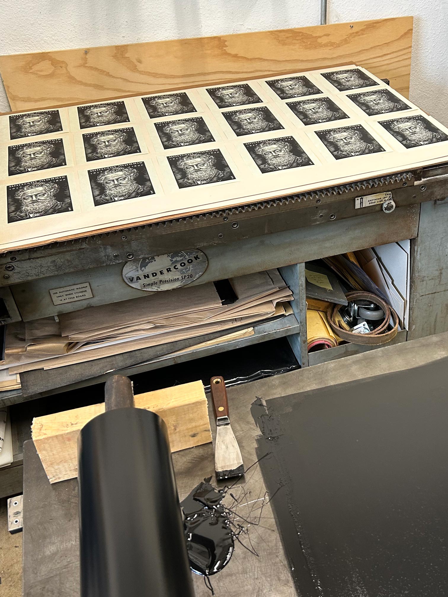
Designed by Jerry Kelly, the book is printed in two colors throughout by Juan Pascoe at Taller Martín Pescador in Tacámbaro, Mexico. The text is printed on dampened Velké Losiny handmade paper using an Ostrander Seymour hand press, in keeping with Morris’s own principles of craftsmanship and production. The text is handset in hot-metal Monotype Poliphilus and Blado, cast by Bradley Hutchinson at his foundry in Austin, Texas, with display type set in foundry-cast Gilgengart.
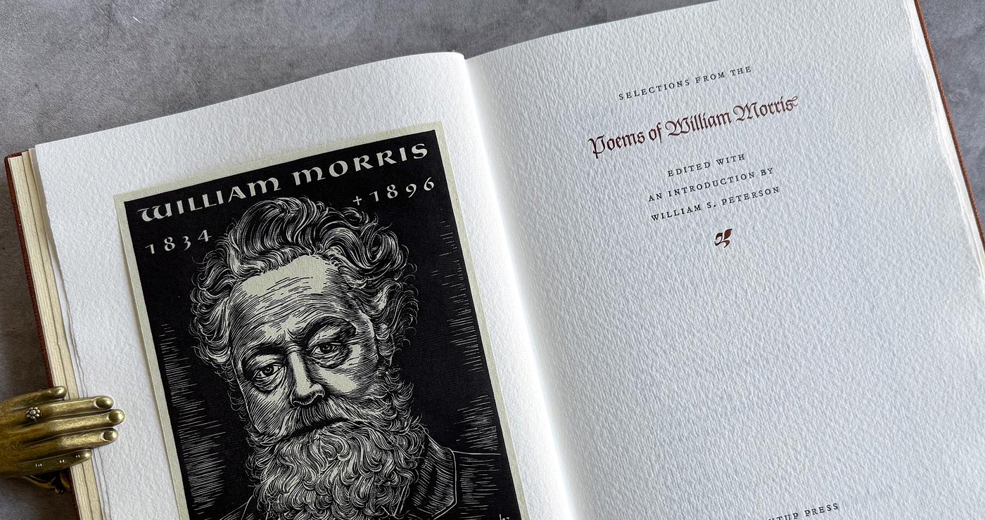
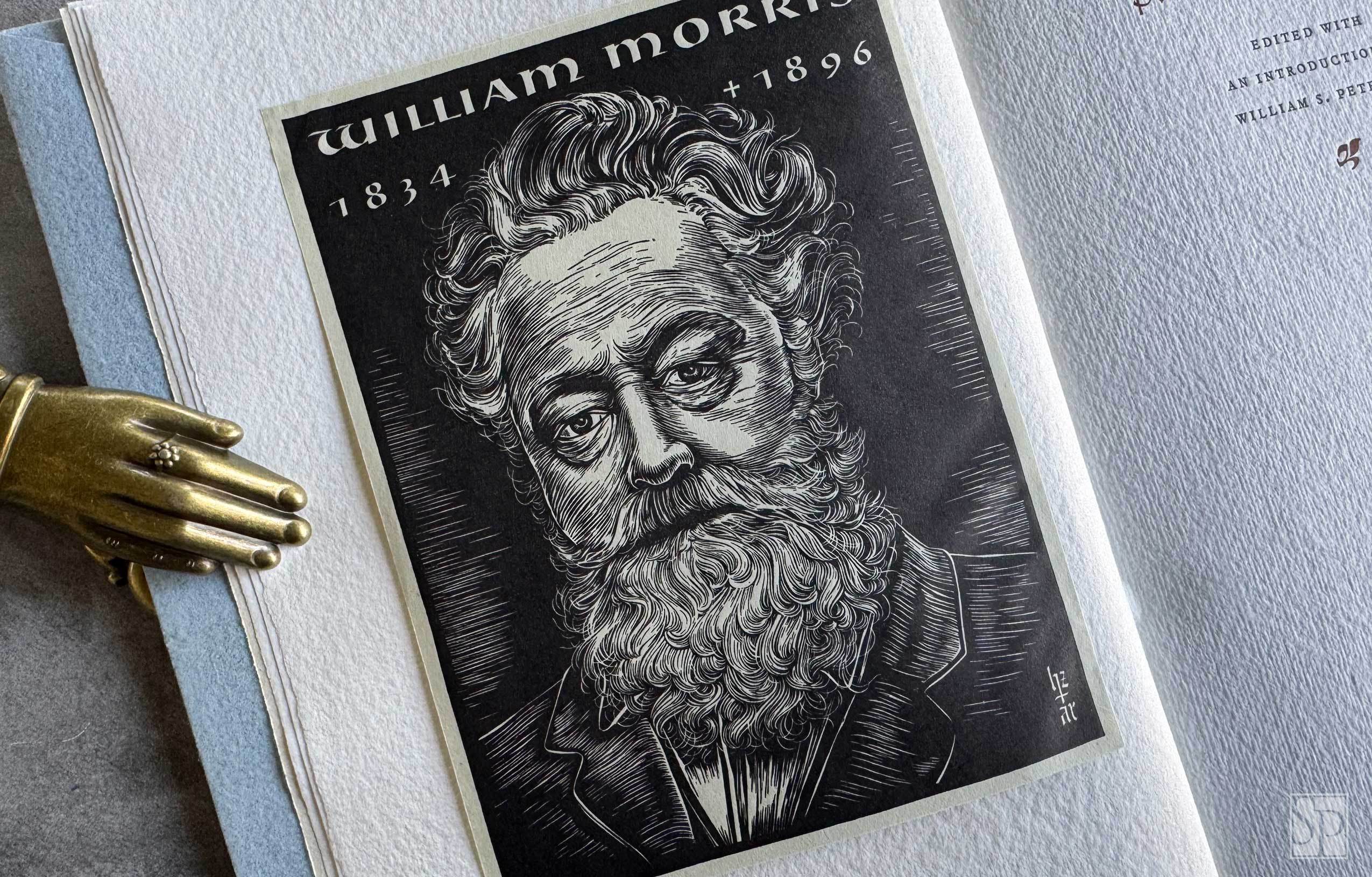
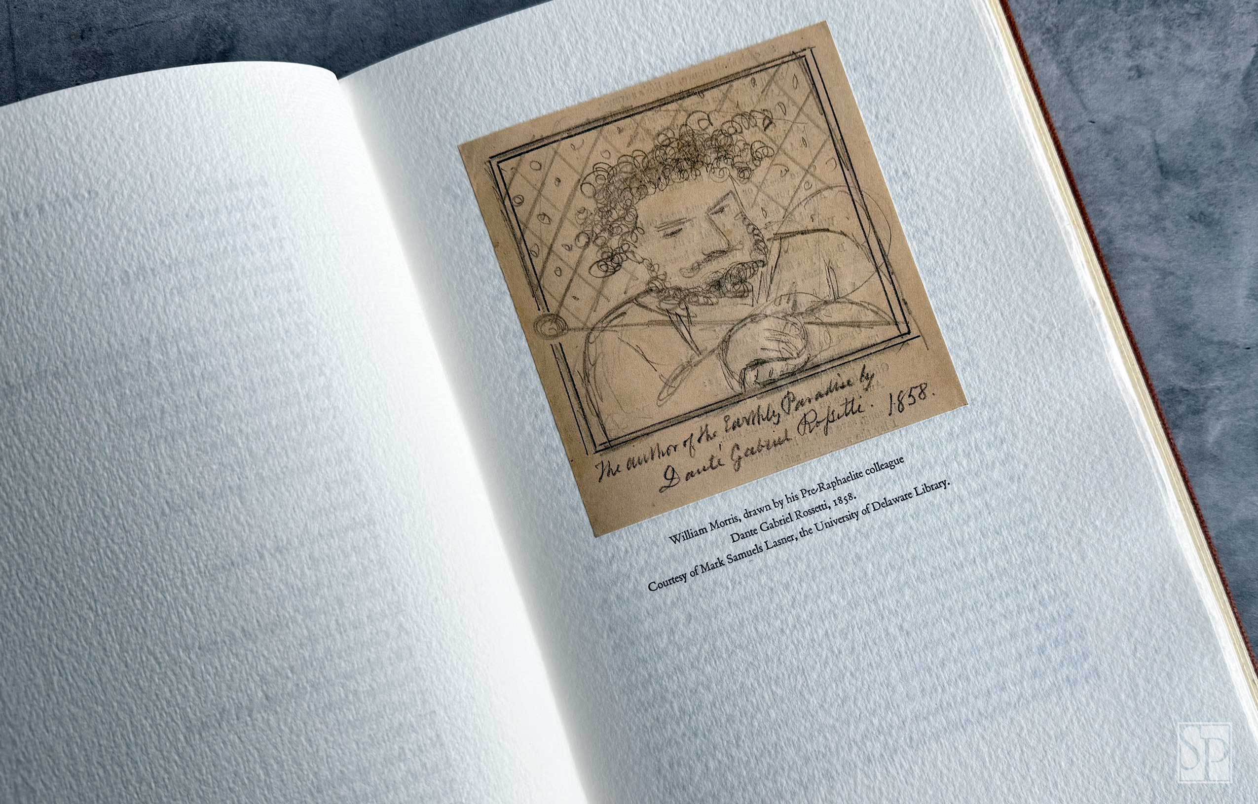
The frontispiece portrait of William Morris was drawn by Hermann Zapf and engraved by hand in lead in 1948 by August Rosenberger, the punch cutter and Zapf collaborator, and is printed from the original metal electrotype plate used to print the image in 1949. The pencil drawing of William Morris, previously unpublished, is by Dante Gabriel Rossetti, Morris’s Pre-Raphaelite colleague. It is reproduced courtesy of the Mark Samuels Lasner Collection, University of Delaware Library.
Published in an edition of one hundred seventeen copies, fourteen of which are hors commerce. The edition measures 7¼ by 11 inches, is press-numbered and signed by William S. Peterson and Juan Pascoe.
A Note on the Typography
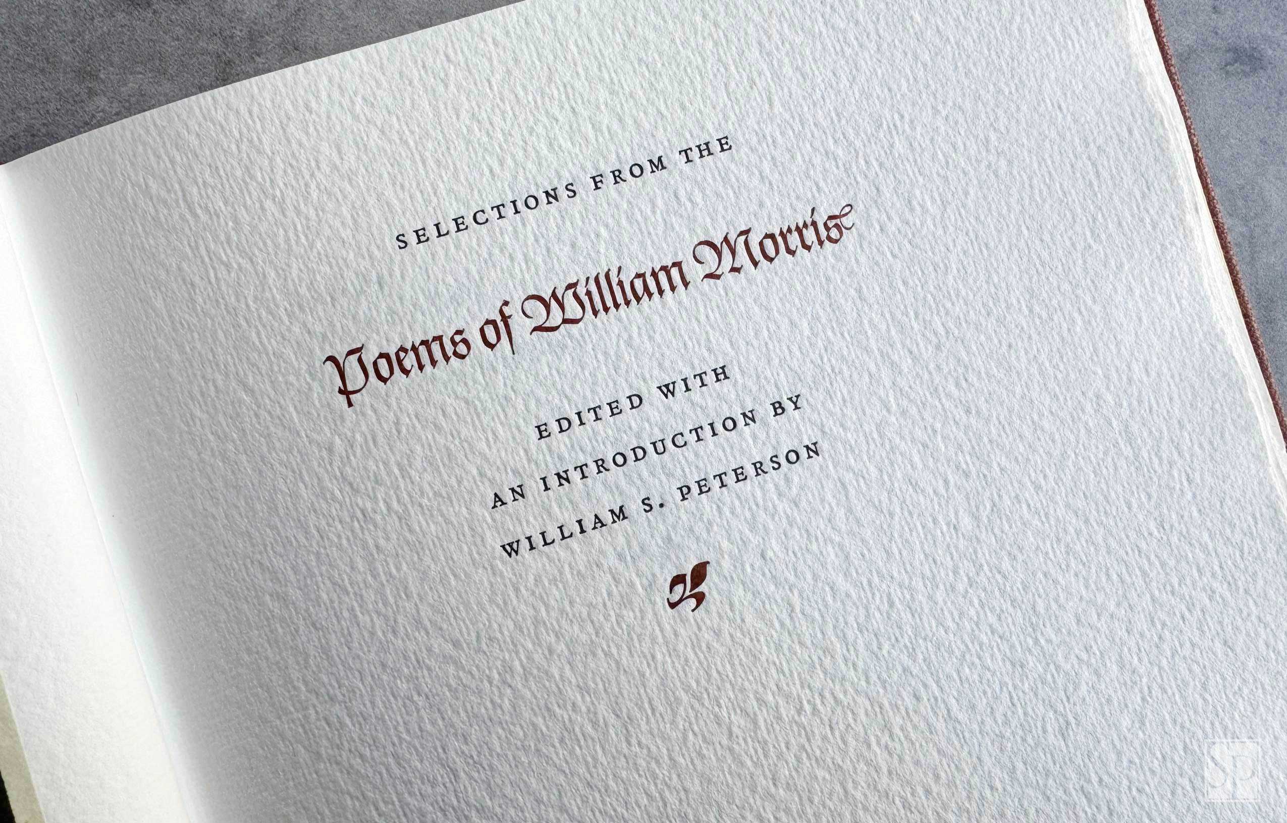
Monotype Poliphilus and Blado, a classic pairing drawn from Renaissance humanist types, form a dignified foundation for Selections from the Poems of William Morris. Poliphilus, modeled after the roman type of the 1499 Hypnerotomachia Poliphili, evokes a sense of antique refinement that complements Morris’s own reverence for pre-industrial craftsmanship.
Blado, the italic companion based on the work of Ludovico degli Arrighi, adds a calligraphic fluidity that aligns with the lyricism of Morris’s verse. This choice of type honors Morris’s legacy by echoing the Medieval and Renaissance ideals that inspired him. The result is a typographic homage both restrained and resonant—fitting for poetry steeped in medieval romanticism and the Arts and Crafts ethos.
The display type is set in foundry-cast Gilgengart, a Fraktur designed in 1939 by Hermann Zapf—his first typeface—echoing the Gothic sensibilities Morris admired.
A Note on the Text
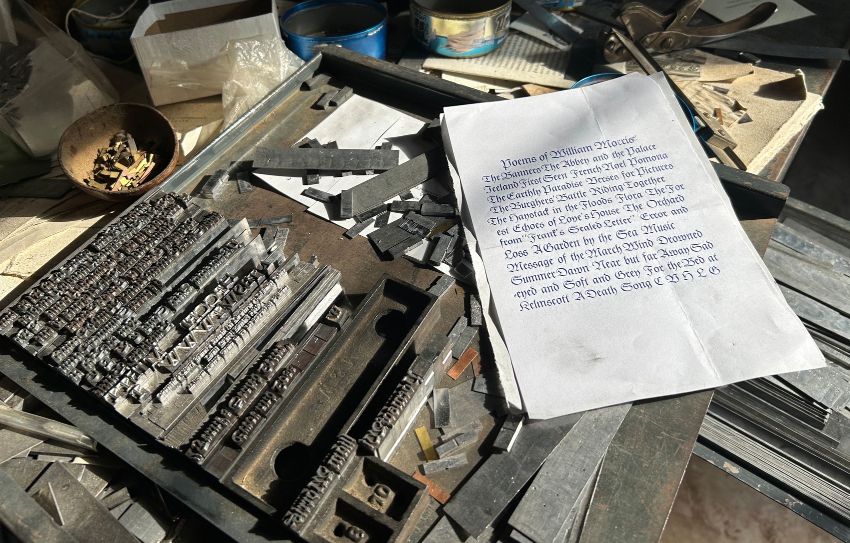
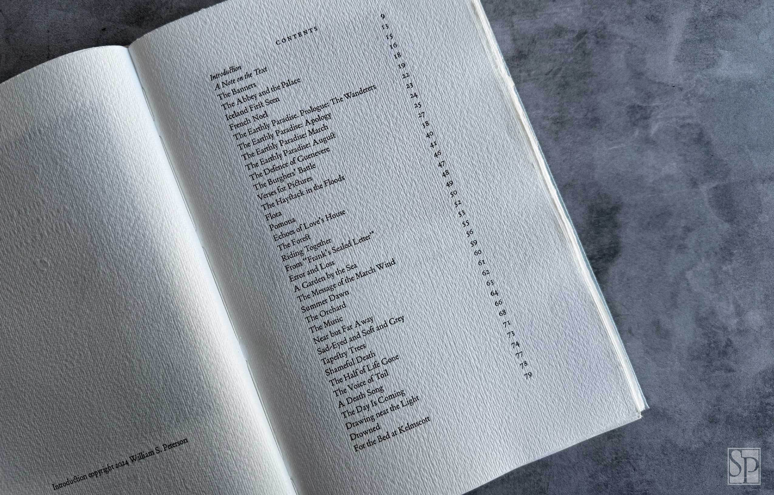
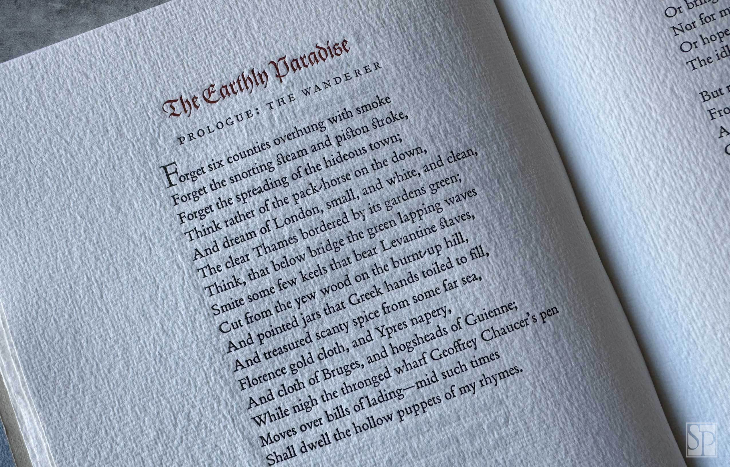
The poems included here are nearly all from two books edited by Morris’s daughter May: The Collected Works of William Morris, 24 volumes (1910–1915), and William Morris: Artist, Writer, Socialist, 2 volumes (1936). The one exception is “The Half of Life Is Gone,” which appeared in The Pilgrims of Hope and Chants for Socialists (1915), also compiled by May Morris.
Standard State
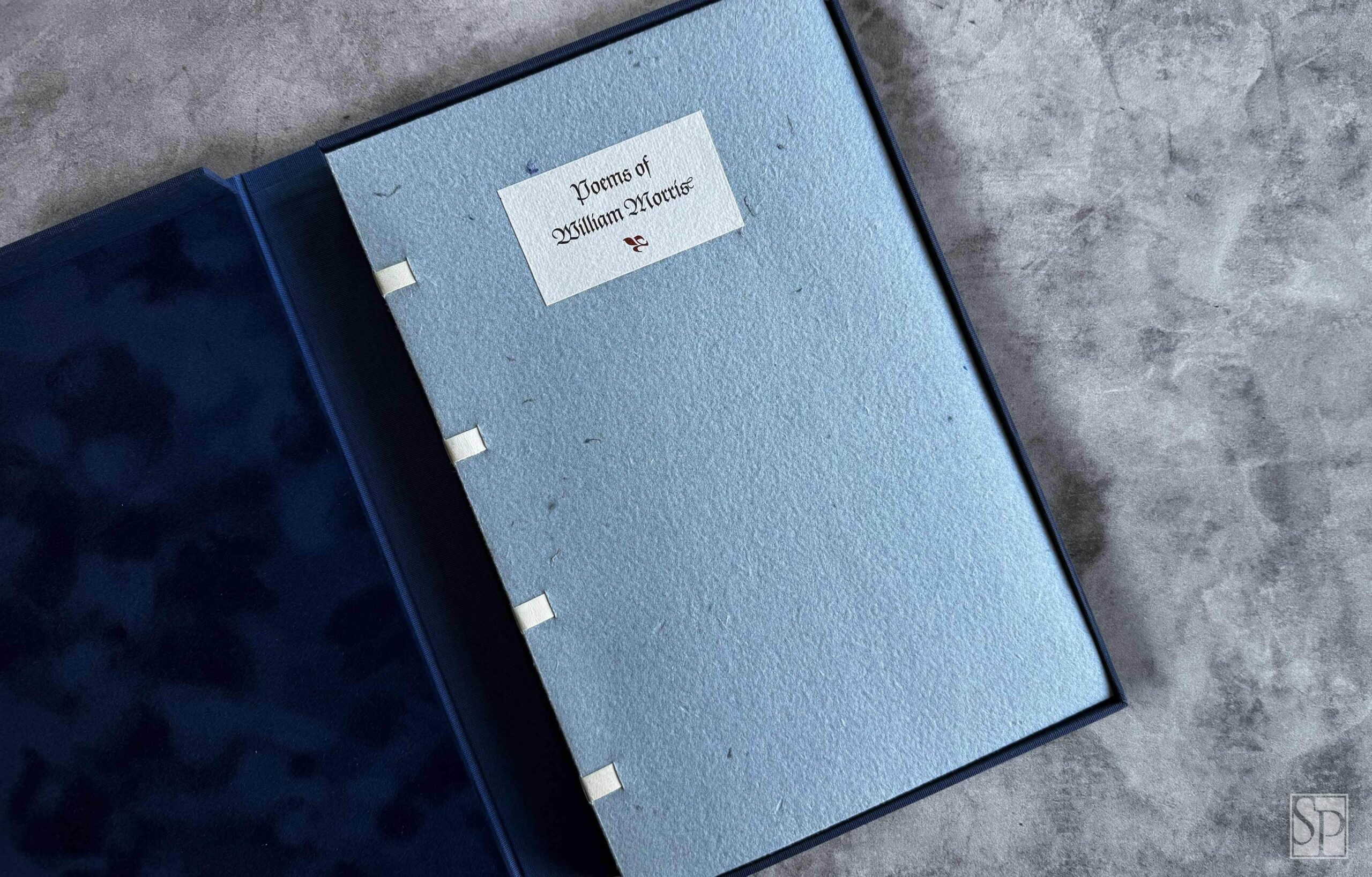
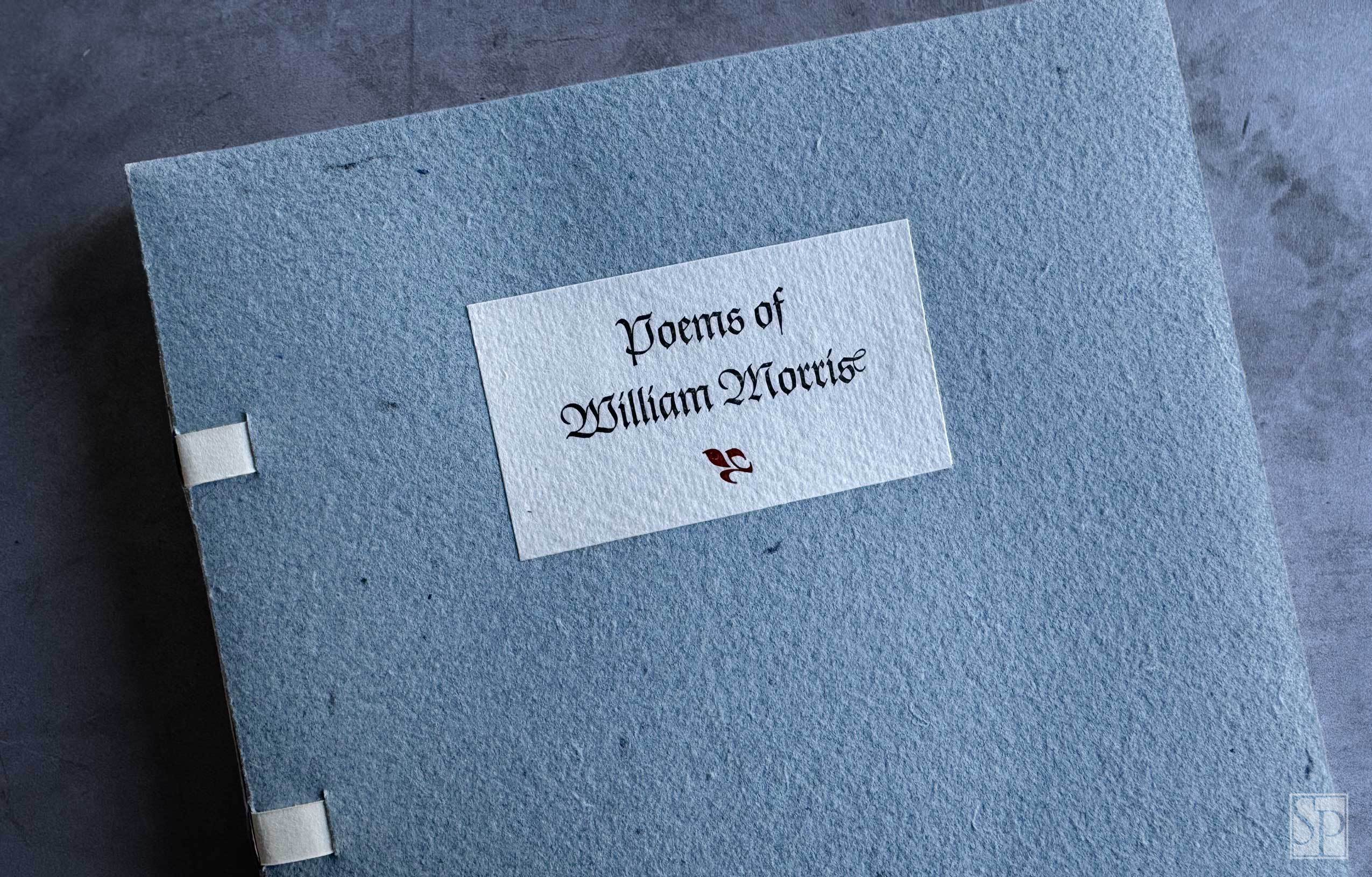
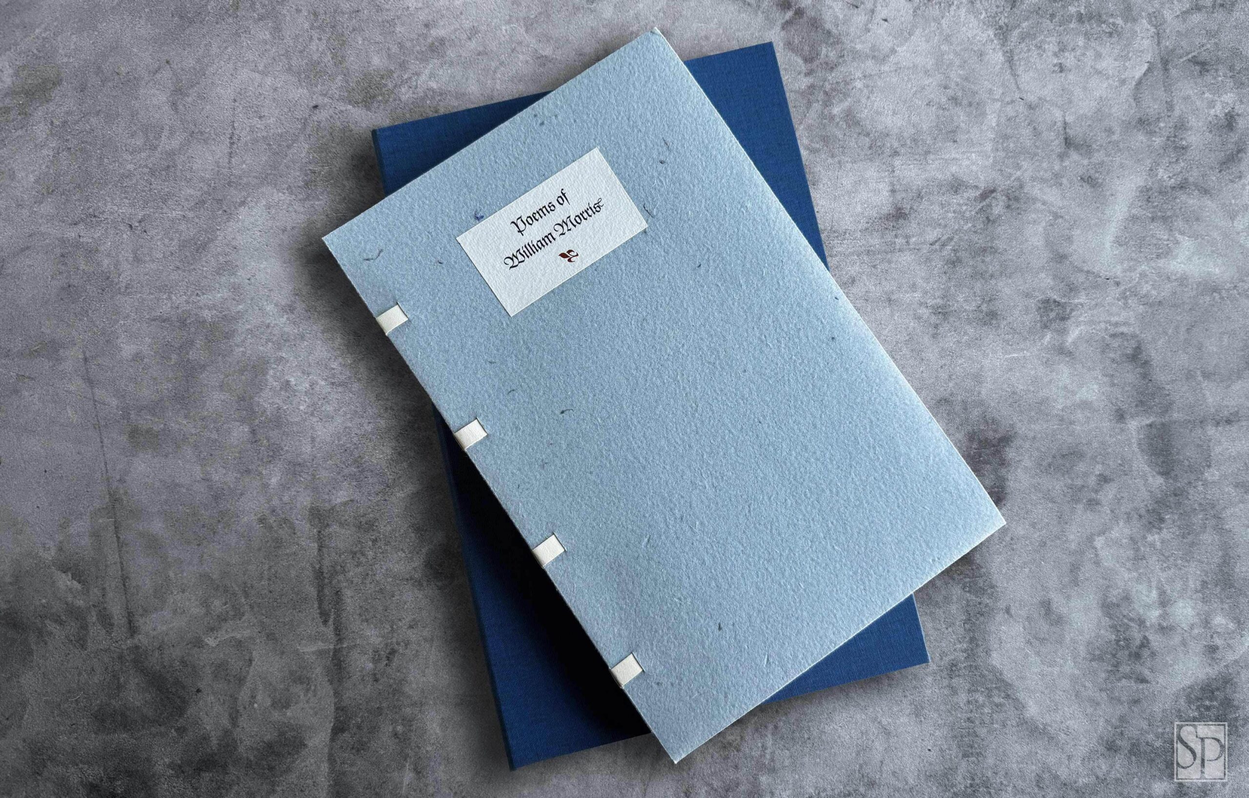
Order NowSeventy-seven Standard state copies, designated 1-77, are handbound by the printer. It is sewn onto exposed vellum tapes laced into stiff handmade paper covers; a stock specially made for this edition at the De Ponte mill in Tlalnepantla de Baz, Mexico. The blue wrappers pay homage to the tradition Morris established with his own publications which featured distinctive blue paper covers that became a hallmark of his work. This design choice echoes Morris’s aesthetic sensibilities, creating a subtle tribute to the craftsmanship and timeless elegance of his publications. The edition is housed in a cloth covered clamshell enclosure with velour lined trays and a letterpress printed spine label.
Deluxe State
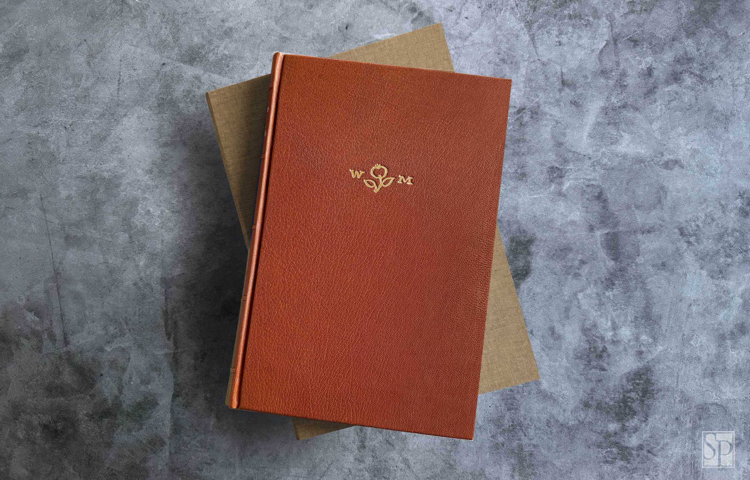
Order NowTwenty-six Deluxe state copies, designated A-Z, are handbound in full leather by Jace Graf at Cloverleaf Studio in Austin, Texas. The spine features raised bands and endsheets are Hahnemühle Bugra. The cover is stamped in gold with one of William Morris’s Kelmscott Press paper watermarks—the letters “W” and “M” set on either side of a central floral device—originally designed for the handmade papers produced for the Press and now one of the most recognizable emblems of Morris’s bookmaking.
The Deluxe state can be seen as an homage to Morris’s values: a handcrafted, materially rich, and historically grounded book object. The edition is housed in a cloth covered clamshell enclosure with velour lined trays and a letterpress printed spine label.
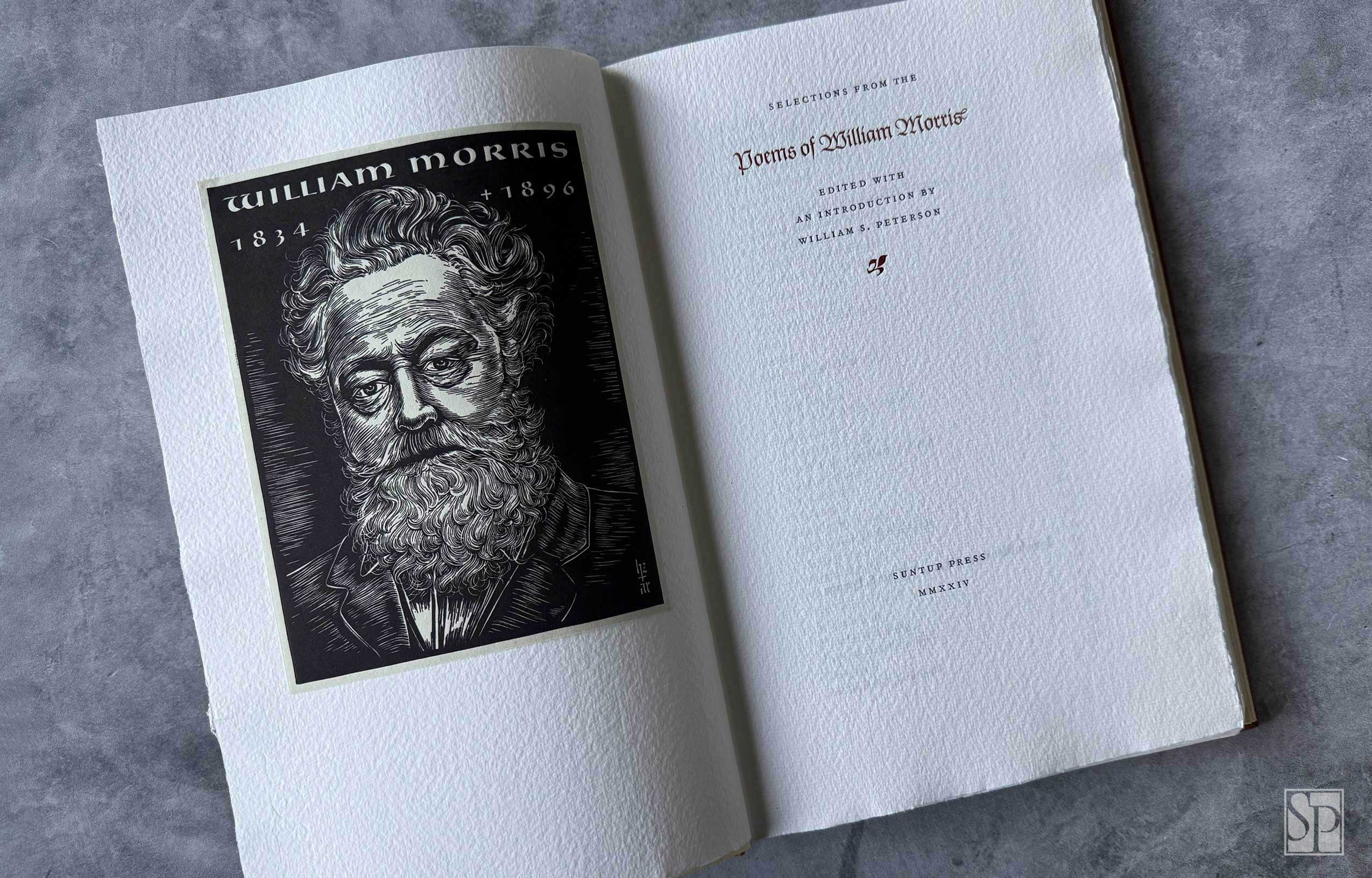
The frontispiece portrait of William Morris
This portrait of William Morris represents a remarkable collaboration between two titans of twentieth-century typography. In 1948, Hermann Zapf—the legendary German type designer—created a portrait drawing of Morris, whose ideals of beauty, craftsmanship, and the unity of art and function had a profound influence on Zapf’s own philosophy.
The drawing was then engraved by hand in lead by August Rosenberger, one of the last great traditional punch cutters and Zapf’s close collaborator. Rosenberger was a master of typographic precision, carving letterforms and images directly into metal punches used to create matrices for typecasting. His engraving of the Morris portrait was executed with the same meticulous care and artistry he brought to Zapf’s calligraphic designs.
This portrait was not merely a graphic image—it was rendered in typographic metal, like a letterform itself. As such, it stands as a rare and elevated form of typographic homage, one that embodies a lineage: the Arts and Crafts ideals of Morris, transmitted through the classical traditions of typefounding and reinterpreted through the hands of Zapf and Rosenberger, who sought not only to preserve but to advance the enduring craft of fine typography.
Each frontispiece was pulled from the original metal electrotype plate. Because the image was printed directly from the plate, every copy in the edition contains an original print—offering not a reproduction, but a direct, first-generation work of art.
About the Author

About the Collaborators

William S. Peterson
William S. Peterson taught for many years in the English Department of the University of Maryland. He is the author or editor of twenty-one books, including The Ideal Book: Essays and Lectures on the Arts of the Book by William Morris (University of California Press, 1982), A Bibliography of the Kelmscott Press (Clarendon Press, 1984), and The Kelmscott Press: A History of William Morris’s Typographical Adventure (Clarendon Press and University of California Press, 1991) [winner of the Felice Feliciano Award, 1993]. He also edited three journals: Browning Institute Studies (1973–1984), Papers of the Bibliographical Society of America (1989–94), and Printing History (2007–2011).

Jerry Kelly
Jerry Kelly is a renowned book designer, typographer, and type designer who has created hundreds of books for prestigious clients such as the Metropolitan Museum of Art, The Pierpont Morgan Library, and The Grolier Club. Since 1977, he has also operated The Kelly-Winterton Press, a small fine-printing operation. Kelly’s work has received over thirty selections for the American Institute of Graphic Arts’ “Fifty Books of the Year” awards, and in 2015, he was awarded the Goudy Award by Rochester Institute of Technology for excellence in typography.
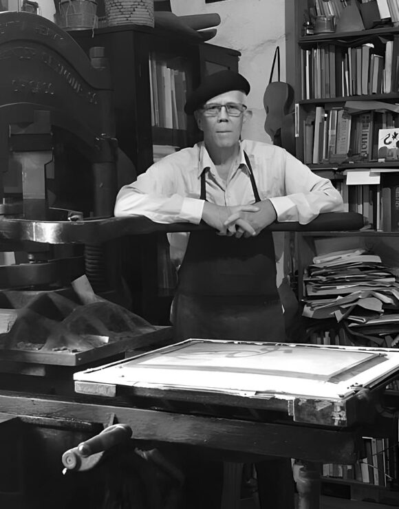
Juan Pascoe
Juan Nicanor Pascoe, born in Chicago in 1946, began his journey in letterpress printing as an apprentice to Harry Duncan at the Cummington Press in Iowa. In 1975, he founded the Taller Martín Pescador in Mexico, where he hand-sets type and prints each page on a nineteenth-century handpress. His press has gained international recognition for publishing works by major Latin American authors like Octavio Paz and Gabriel García Márquez while maintaining traditional craftsmanship. In 2011, Pascoe was awarded the Premio Eréndira for his contributions to Mexican arts and culture.
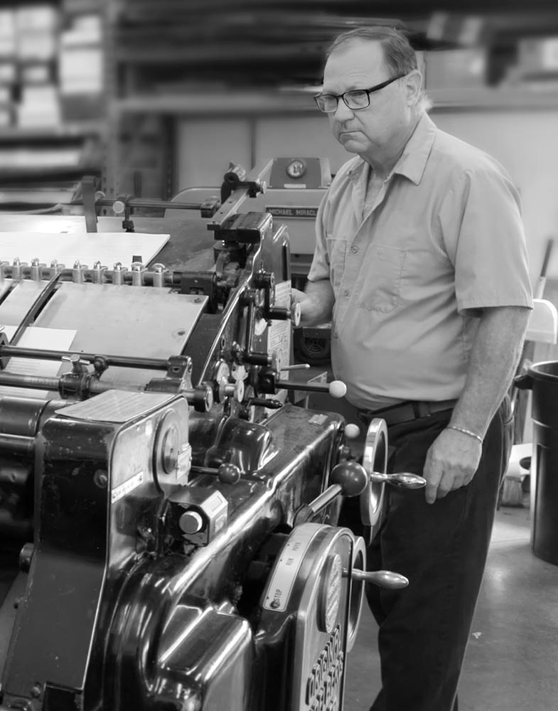
Bradley Hutchinson
Bradley Hutchinson is a renowned fine letterpress printer with over 40 years of experience. In addition to his printing work, he operates a type foundry established in the late 1980s, specializing in hot metal casting. Using classic British Monotype matrices including Bembo, Bell, Blado, Erhardt, Perpetua and Poliphilus, among others, Hutchinson has cast type for various significant projects, including Poliphilus for an edition of Sir Gawain and the Green Knight printed by Juan Pascoe, and the Stanze of Pietro Bembo in both Italian and English.

Jace Graf
Jace Graf owns and operates Cloverleaf Studio, a book arts business located in Austin, Texas. He completed a graduate book arts degree at Mills College in 1990 and then went to work for five years at BookLab, the premier edition bookbindery in the country at the time. Jace specializes in hand bookbinding, boxmaking and book design. His work is now held in many private collections, library special collections and museums across the country.
This edition carries no rights, and is not included with lifetime subscriptions.
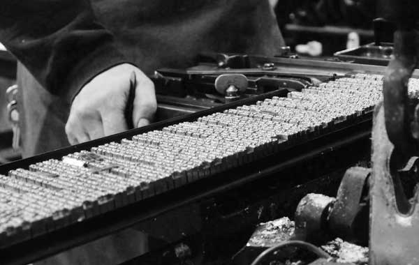
Printing the William Morris Plate by Bradley Hutchinson in Austin, Texas

At Taller Martín Pescador in Mexico: A Glimpse into the Pressroom